Friday, 11 December 2009
Changes I made to my article
To get the final draft of my article I changed many things. Firstly, I split it up into paragraphs, as it made the article more clear and easy to read, and was also grammatically correct. I also changed minor things, like the punctuation, or changed words for stronger words. I also decided to take out a lot of the information about her fashion, as it doesn't appeal to the target audience, who are adult males. Also, I decided to say a bit more about her musical influences as the article needed to have more information about her music rather than her fashion choices! This would appeal to the audience of the magazine a lot more. I also changed "she has only just started" to only just emerging on the music scene". I changed some of the word choices, as I felt I was saying "this girl" far too much. I also decided to take out the word "cool" as I felt that this made the article seem childish, and it is mainly aimed at teenagers and young men. I changed the phrase "newest indie-diva on the block" to "big talent for 2010", as I felt that this sounded a lot more professional, as the term talent is used a lot in the music industry. I also changed one of the quotes, and this was to enhance the idea that she was a confident and arrogant person. Finally, I separated the last sentence "...and I can tell that this girl is a diva in the making, and you boys had better watch out", into two separate sentences, as I felt that this had more impact. Overall, I think that my overall article is effective, and appeals to my target audience with a direct address to them at the end of the article.
Wednesday, 9 December 2009
2nd draft for my article
As Jodie Flair sweeps into the room nonchalantly, I can’t help but stare. She is wearing very little, and looks like every boys dream rolled into one. As she sits down, she says to me “Well let’s stop staring and get on with this interview then”. Even from the moment she walked into the room she had established herself as a diva-type, from her confident strut to her hair toss, but this confirms it. This is the amazing thing about her. She is acting like a diva who has been in the business for years, when she is only just emerging on the music scene.
We start talking about her outfit, and when asked who she gets her fashion inspiration from she replies “I don’t need inspiration. I’ve always been fashionable”. She certainly has proved herself to very high in the fashion stakes, flaunting all kinds of outfits in public like some toned down version of Lady Gaga. I ask her about the idea behind her debut single, “Peas”, and she starts telling me about previous boyfriends, chance and unrequited love. However, I kind of get the feeling there is something more. “Let’s face it” I say, “You just love peas don’t you?”. At this, she laughs right on cue, for which I am highly grateful. “I do actually” she replies. “When I was little I used to build pea towers and stuff like that. And I never used to be told to eat my peas, I always ate them anyway. I was a really cool kid”. I have to laugh at this. Jodie even makes a childhood habit of building towers out of peas sound like some unique hobby.
Jodie has no fears about being individual and pushing the boat out in the music industry: the video for the single features Jodie wearing a pea green lycra catsuit, with pea dancers all around her. She has taken many of her influences from artists like "Goldfrapp" and "Florence and the machine", but says she does not want to become like another artist; "I want to be totally unique. I think I will be. But fucking hell, even unique isn't unique nowadays." We then talk about when the forthcoming album, “Never say never” will be released. “April 4th hopefully” she says “But we’re hoping that the single will be so popular that we can get it released a lot earlier! I’ve got a lot of confidence that it will”. I can tell that this girl has no doubts about her own ability: she has a good voice and she knows it. Jodie then goes on to tell me about how her interest in music developed from when she was a child, when she used to perform singing concerts to her whole family. “If they didn’t applaud enough, I would go in a sulk for the rest of the day!” she laughs. In fact, Jodie’s mother knew she had an amazing ability from a young age. She sent her to the prestigious drama and music school “stage coach” in the hopes that it would help to get her into the music business. And it has obviously worked for 18 year old Jodie, who is set to become big talent for 2010. “I could totally beat Beyonce in a fight. She would get totally thrashed”, are the final words from Jodie about ultimate diva Beyonce as she saunters out of the interview room, hands on her hips, and I can tell that this girl is a diva in the making. You boys had better watch out.
1st draft for my article
As Jodie Flair sweeps into the room nonchalantly, I can’t help but stare. She is wearing very little: a massive fur coat, mini-dress and spiked heels at most. She looks like every boys dream rolled into one. As she sits down, she says to me “Well let’s stop staring and get on with this interview then”. Even from the moment she walked into the room she had established herself as a diva-type, but this confirmed it. This is the amazing thing about this woman…or girl. She certainly looks like a woman. She is acting like a diva who has been in the business for years, when she has only just started. We start talking about her outfit, and when asked who she gets her fashion inspiration from she replies “I don’t need inspiration. I’ve always been fashionable”. She certainly has proved herself to very high in the fashion stakes, flaunting all kinds of outfits in public, and appearing in the fashion magazines daily. I ask her about the idea behind her debut single, “Peas”, and she starts telling me about previous boyfriends, chance and unrequited love. However, I kind of get the feeling there is something more. “Let's face it” I say, “You just love peas don’t you?”. At this, she laughs right on cue, for which I am highly grateful. “I do actually” she replies. “When I was little I used to build pea towers and stuff like that. And I never used to be told to eat my peas, I always ate them anyway. I was a really cool kid”. I have to laugh at this. This woman even makes a childhood habit of building towers out of peas sound like some cool, unique hobby. I can tell that this girl has no fears about being individual and pushing the boat out in the music industry: the video for the single features Jodie wearing a pea green lycra catsuit, with pea dancers all around her. We then talk about when the forthcoming album, “Never say never” will be released. “April 4th hopefully” she says “But we’re hoping that the single will be so popular that we can get it released a lot earlier!”. I can tell that this girl has no doubts about her own ability: she has a good voice and she knows it. Jodie then goes on to tell me about how her interest in music developed from when she was a child, where she used to perform singing concerts to her whole family. “If they didn’t applaud enough, I would go in a sulk for the rest of the day!” she laughs. Jodie’s mother knew she had an amazing ability from a young age. She sent her to the prestigious drama and music school “stage coach” in the hopes that it would help get her into the business. And it has obviously worked for 18 year old Jodie, who is set to become the newest indie-diva on the block. “I could totally beat Beyonce in a fight. She would get totally thrashed” are the final words of Jodie, as she saunters out of the interview room, hands on her hips, and I can tell that this girl is a diva in the making, and you boys had better watch out.
Friday, 4 December 2009
Planning and evaluation of an article
The first article I have chosen to look at is an article from NME on "East Coast Avengers". Here are some examples of the type of language that is used. Slang and informal language is used for a large part of the article. An example of this is: "Nasty, old, piss-reeking, racist bigots". This language also seems very confrontational, which shows that the article is trying to prove a point. Humorous similes have also been used in the article: "Bloggers fell on the track like sharks attacking a sack of bleeding puppies". The article also uses strong adjectives, as the article has a strong content, and it really wants to emphasise its points: "Lying, scheming, embezzled". The article also uses pull quotes, and the language in these seems a lot more serious than some of the language in the article, and maybe this would encourage people to read the article more: "This was sickening, hilarious, dangerous, pathetic. Hell, wondered some, was this even legal?". Although the content of this is serious it actually has quite a light hearted tone. This is true of the whole article, as although it has serious content about a rap band who write offensive lyrics about politicians, the tone of the article is fairly light hearted and jokey. Maybe this is to make a joke of the whole situation, and make it seem like a farce. The article is an interview, but the way it is set out is to have the questions being incorporated into the actual writing, rather than having a question-answer interview. However, the article is mainly based around writing about the controversy and incidents of the band, rather than incorporating questions into it.
The second article is from Q magazine and is on "Razorlight". The article uses language in different ways. The article includes quotes from other people that relate to the article, but that are not used as pull quotes. E.g. "Jesus, do you think Churchill stopped the war because it was his wife's birthday?". This uses quite jokey and light hearted language, which is helping to show that some members of the band have a sense of humour and can have fun. Casual, swearing language is also used in the article, and this helps to show the audience of the magazine. Short hand versions of words are also used e.g. "cos". This is used to make the band seem a lot younger and more stylish, by using text language. The tone of the article is mainly light hearted, informal (with lots of swear words) and humorous. It is designed to "take the mickey" out of the lead singer of Razorlight. This tone makes the band seem more light hearted and approachable. It is largely based on an interview with razorlight, but it does not just split it into individual questions, it splits the article by different events for the band and talks and interviews them about these events.
Overall, both the NME and Q articles have helped in giving me ideas about how to structure and write the article for my music magazine.
Wednesday, 25 November 2009
Examples of editing

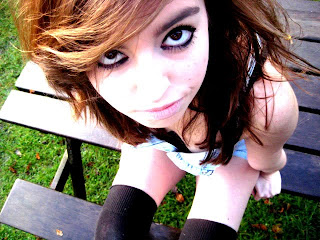
For this image I simply changed the contrast and brightness. I made the image look a lot more contrasted as I think that this looks more professional and also helps to emphasise bright colours and make it look a bit less real life. It also helped to emphasise the subjects eyes by doing this, and really get across the kind of heavy eye makeup that she wore. Her hair also looked a lot better when it had been brightened as it brought out a lot more highlights.
This is how I did it:
I clicked "image and then "adjustments" and then "brightness and contrast". I then changed the levels: brightness 42 and contrast 86. The editing was then complete. I think that the simple task of editing my photos will help to make a big difference to the professional quality of my magazine. I used similar editing techniques for my other photos, and simply either make them black and white and changed the contrast, or left them in colour and changed the contrast.
Examples of editing


This is my cover image. For this image I decided to change it into black and white. I chose this as I felt that this was not typical for a magazine cover, and did not conform to usual stereotypes. This would then help to emphasise the fact that the magazine is an indie magazine. Also, I chose to put it in black and white as I felt that this would make the image a lot more effective and authentic. I also changed the brightness and contrast of the photo. This made it look a lot more professional and just generally improved the quality of the photo. It made certain things on the image stand out, for example the dress the tree and the bucket. I felt that having it more contrasted gave it a more magical, fairylike setting and made it look less real.
This is how I did it:
To change it to black and white I clicked "Image" and then "adjustments" and then "black and white and it put the image into black and white for me. It put it onto the default black and white setting. I then went on to "image" and "brightness and contrast" and set the levels to this: brightness -6, contrast 79. The image editing was then complete.
Monday, 23 November 2009
Photos
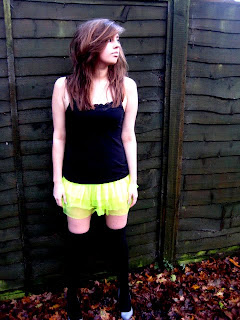
This is the final photo, which I will use in my contents page. This means that the image will be very small on the page. It is quite a simple photo, but I think it is quite effective. The outfit for the photo was fairly simple, just a black top, a tutu, socks and high heels, but I think it is effective in showing a different side to the artist. Before we had seen her in flowery dresses and denim shirts, but here the neon tutu helps to make the outfit seem more outrageous. It helps to show that the artist has a wacky side, and that her music is nor mainstream. The setting of the photo is fairly simple: against a green fence. I think that this is effective with the outfit I have chosen, and helps to emphasise the brightness of the tutu and the wackiness of the artists outfit. Finally, I have chosen to portray a very simple pose. This contrasts with the bright outfit, and I think makes the artist seem more real. As she is gazing into the distance it looks like she is contemplating something, and makes us see that maybe she has a deeper side to her. Overall I think that these elements help to fit with the style of magazine, especially the outfit which helps to highlight the individual nature of the magazine, and also the photo appeals to the target audience as she is wearing a low cut top and a short skirt.
Photos

I have decided to use this photo as the main image of my double page spread. It will take up one half of the spread, as I feel that it is a strong image. I think that the mise-en-scene of this photo helps to emphasise the genre of the magazine and would appeal to the target audience. I chose the costume as it seems a very relaxed, casual outfit of a denim shirt, socks and ugg boots, but at the same time it also gives sex appeal as there is leg on show. Also, this kind of outfit is reminiscent to the iconic image of the woman in the shirt and socks playing guitar. You cannot see all of the artists face, but you can see that she is smiling. This then suggests that although she may have previously appeared moody, she does have a fun side to her. I think the pose that I have chosen is effective, as the way that she had her leg helps to show a more casual side to the star, as it is quite a casual pose. It also helps to give the photo sex appeal, by showing more leg. The subject of the photo is framed in the trees, and I think this is effective as it helps to emphasise the fact that she is the main subject in the photo. The setting is effective as it is quite a simple, natural setting, which just allows you to just focus on the girl in the photo. Overall, this image helps to show the genre of the magazine as it shows that it is an indie magazine, that does not take the usual close-up shots of artists like so many magazines do (e.g. magazines like "top of the pops" do this). Also, I think that another main reason for me choosing this image was the fact that it does appeal to the target audience, as it has subtle sex appeal, but it is not too in your face.
Photos

This photo I have decided to use for my article as well. The costume I have chosen is not clearly visible, however when I was taking the shots I had chosen a denim playsuit to be worn with long socks and high heels. I felt this provided a slightly "cheekier" image for the artist. I also decided to emphasise her big eyes with heavy eye makeup, but have played down the colour of her lips. I like the angle that this shot was taken from, as this gives it a bit more variety than all the other shots I have taken. It also gives the image sex appeal, as a lot of her legs are on show. The setting seems very ordinary and everyday, which contrasts with the actual artist in the image, who seems to have a more indie style. This is why I chose this setting. I think that the image fits with the overall style of the magazine as it is more of an adult magazine, and this kind of picture would appeal to them. Also, because the artist has indie style this fits in with the indie style of the magazine. Also, it appeals to the target audience as the artist is attractive and is showing off lots of leg, which many men would find attractive, and this would maybe encourage them to find out more about the artist. Overall, I think that this is a very strong image, and would work for putting in the article about the artist, and showing a more "cheeky" side.
Photos
 I have chosen this photo to be a part of my article on the made-up artist I have created, "Jodie Flair". I made certain decisions on the mise-en-scene of this image. Firstly, I chose this costume as it is bright and colourful, and helps to suggest the sunny nature of the artist's music. Also, I added the jacket to help make the look a bit more "rock chick" and harden the image a bit more. Having the long socks with the high heels also helps to show that the artist has an indie look, but also adds more sex appeal as she is wearing a short dress. Her pose is looking down so you cannot see her face. I chose this as it helps to give her an air of mystery, and also because it made a change than having shots of the artist looking at the camera every time. The setting of the shot is quite idyllic and natural, which I think helps to suggest the nature of her music. The fact that she is standing on a child's swing is ironic, as she is dressed in very "adult" clothes, that an innocent child wouldn't wear. The fact that the subject in the picture is framed by the swing also helps to make the composition more interesting and varied. I have tried to vary the compositions throughout my photos. These elements all reflect the genre of the magazine, as the female readers would look at these clothes and know that they were in fashion for a more "indie" person. It also appeals to the target audience as it is showing a lot of leg, which many men would find attractive. This would maybe encourage them to read the whole article.
Photos
 I have chosen this photo as my cover photo. I chose this because I felt that it was the strongest photo in showing the genre of the artists music, through the clothes and the setting it portrays (the mise-en-scene of the photo). Having her wearing an individual dress helps to connote the fact that she is not a typical "pop star" and that she has some authenticity and individuality about her. Also, I thought that the setting went with her style of magazine as she will be an artist who has a similar audience to "Florence and the machine". It helps to show the indie and natural nature of her music, as if the photos were taken in the city it would represent more of a street style of music. Her makeup I chose for her to wear also helps to connote her style of music. I had her wearing were heavy eye makeup, as I felt that this was a lot more individual than a lot of styles that other artists wear. I also styled her with big hair with lots if hairspray in it. I did this as most artists nowadays are always after pristine hair, and I felt that having her hair a bit more messy would help to show her indie image more, and show that she is not an artist that tries to conform to stereotypes. The pose she is doing is quite natural, and does not look forced at all. Also, it helps to appeal to men as the pose is showing a bit of her leg, but not too much and this will intrigue them as they will want to see more. All of these features of the photo help to show the genre of the magazine (indie), and help to highlight the fact that it does not conform to stereotypes of how a typical star should look. It also appeals to the target audience, which is mainly men, as it quite a sexy picture, showing an attractive artist. This may encourage them to buy the magazine, even if they do not usually. Overall, I am very happy with this cover photo.
Thursday, 12 November 2009
Flat plan for double page spread

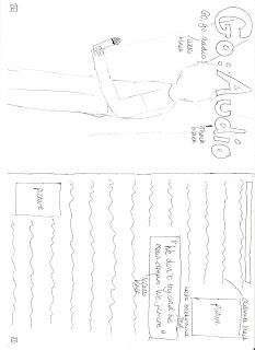
I also had to consider my target audience when designing my double page spread. The title of the article, the name of the band, is in a new font that has not been used before in my magazine: shock. I thought that this font went well with the style of magazine. The title of the article will be very big and bold, and take up the top of one page of the spread, in a black font. There will also be a tagline underneath the title, in the font sciallo. Having the title just the name of the band conforms to music magazine conventions, as many music magazines use this technique e.g. NME. Also having a tagline underneath the title is similar to many magazines, as it provides a bit more interest to the article. Having the title of the article in black rejects usual conventions as usually magazines would use a different colour for the title, but I felt that the colour black makes the article a bit more edgy and fits with the band's style of music. Having a big, bold title and a tagline would appeal to the target audience, as that is what they expect out of a music article, and will also add more interest to the relatively boring title. Also on this side of the spread is a picture of the lead singer of Go:Audio, which will take up the whole page. Having the photo of the band taking up one whole page of the spread rejects and conforms to magazine conventions, as some double page spreads in magazines (like one about "The teenagers" in NME) have whole photos taking up one side of the spread, however, other magazines may have smaller photos, as the articles may be a lot more in depth. This would appeal to the target audience as it allows for the reader to see clearly what the band actually look like, and give an insight into their personality. Finally, on the spread I have included text boxes which say the page numbers. This conforms to magazine conventions, as all magazines have to display these as they are important information. The target audience would like the fact that the article has page numbers, as all magazines have them, and it would allow the article to be found easily. I have also included a banner at the top of the other page of the article, and this will say things like the name of the magazine and their website. This is to reinforce and advertise the brand. This conforms to many magazine conventions, as many magazine include a banner to advertise this information, however, having it at the top of the page instead of the bottom makes it slightly different from other magazines. The main font of the article will be oceania, a sans serif font, and in the colour black, as this will allow it to be subtle, but also not so small it is hard to read. This conforms to magazine conventions, as all magazines try to have the main text in the article in a sans serif font, so it does not look to complicated or over the top. This would appeal to the target audience as they will want to be able to read the font of the article clearly. I have also included two smaller pictures on the article, to give people a bit more of an idea about what the band look like. This conforms to magazine conventions, as most magazine articles contain smaller images of the band, as well as the big main image. This would appeal to the target audience as it would allow them to see what other members of the band look like, not just the lead singer. I have chosen to have a plain white background, as this is simple, and will help to focus people's attention more on the article. This conforms to magazine conventions, as most of the articles I have read use a plain white background to make images and text stand out. This would appeal to the target audience as the page will not look too complicated and the text will be easily read. Finally, I have used a pull quote in a text box, to help the audience to see a bit more about the band, and make the article more interesting. I have used a different font from the main body of the article as this will make it stand out more, as it is a lot bolder (sciallo). This conforms to magazine conventions, as most magazines use pull quotes in interviews as they are very bold on the page, and can entice someone into reading an article. This would appeal to the target audience as they would want to know more about the band and see what they are like before reading. Overall, my double page spread appeals to my target audience, even if it does reject some magazine conventions. I am pleased with all my flat plans, and feel that they are detailed enough to be able to form my magazine effectively.
Flat plan for contents page
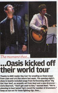

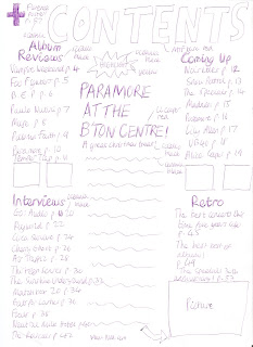
For my contents page, I have chosen my designs based on what my target audience would want out of one. For the title, saying "contents" I have chosen to use the same font and colour to the one used for the title of the magazine-mtf base in red. The title will also be in a large size, so the audience can be clear about what page they are on. This conforms to magazine conventions as most magazines have a title at the top saying "contents". However, some magazines do not do this, like NME, which just says "this week". I felt it would be clearer to make sure that people knew exactly what the page was. I think this would appeal to the target audience as they may want to be able to quickly find the contents page, so they can find a specific article. I have split the contents page into four sections, "reviews", "interviews", "coming up" and "retro". For the titles of these different sections I have used the font sciallo in black. I have also made them bigger than the information about the actual pages, as it will allow people to find a particular section of the magazine easily. For the page information and numbers I used the font oceania in black, as this is going to be the font for all the main text in my magazine. In the information about the pages, for three of the sections I have only put the name of the band it is about, as I think that that is all the information you need to know if you are wanting to read the article anyway. However, for the "retro" section at the end of the magazine I have used the names of the actual articles, as it is a specific section which only has three articles, and people would want to know more about it. In some ways these design ideas conform to magazine conventions, but in others they don't. The idea of having the contents page in sections is a technique that is used often in music magazines, to break up the contents page a bit more. Also the idea of having the titles of these sections in a bigger font than the information is used often, for example in NME. Also, having the names of only the bands to give information in the contents page is used a lot in music magazines, such as NME, as there is very limited space in a contents page. However, the idea of having a "retro" section at the end, with only three articles, rejects usual magazine conventions, as usually the sections would be easily spaced out and all the same length. However, I felt that this section would be the least important to readers, but they would still find it interesting, so I decided to include it in the magazine. Also, it would appeal to the older readers of the magazine. Having the contents page split into different sections would appeal to my target audience as they would want to be able to find information easily and quickly. Also, having only the names of bands for page information would appeal to the target audience, as it would allow them to look for a specific band quickly. Finally, the idea of having a retro section would appeal to the target audience, as they would want a bit of variety when reading the magazine. I have included pictures relating to certain articles in the contents page, and these will show people a bit more about the article and make the contents page more interesting. The idea of having pictures about certain articles conforms to magazine conventions as basically all magazines do this, but music magazines especially. This would appeal to the target audience as it would allow them to see a bit more about a specific article. I have also included a "highlight" article, on Paramore doing a concert. I felt that this would draw more attention to the contents page. For this I used the fonts sciallo, oceania and ll cooper. I made the title of the article red, to go with the colour scheme, and draw attention to it. I have included a text box saying "highlight", which will draw people's attention towards the article, as the text box is in the shape of an explosion and will be yellow. There will also be a large picture to go with the article, to show a bit more about what it is about. It conforms to many conventions of music magazine, as many magazines do use these highlight articles in their contents page, for example NME had a highlight article on Oasis. The idea of having the title of the article red also conforms to magazine conventions, as many magazines use bright colours to highlight titles. Having this article in the contents page would appeal to the target audience as it helps to make the contents page more interesting, and could help them to decide whether they want to read the full article or not. I have included the website address for the magazine at the bottom of the contents page. This conforms to magazine conventions, as almost every magazine will try to advertise their website, and the contents page is one of the best places to do it. Having the address in the contents page will appeal to the target audience as it is in an obvious place, and they will be able to find it quickly. Finally I have included information about a separate "freebie" in the top left hand corner of the contents page. This helps to show that it is not the most important piece of information on the page, but can still be seen clearly. With this article I have included a giant "+" sign, which draws more attention to it. The conforms to magazine conventions as a lot of magazines use a plus sign to draw attention to a certain article or groups of articles. Having it in the left hand corner, however, rejects magazine conventions, however I think it will be bold enough to be seen. It appeals to the target audience as it is clear and easy to see, but at the same time does not get in the way of page listings for other articles. Overall, I think that my contents page conforms and rejects certain magazine conventions, but the layout of it definitely appeals to my target audience.
Wednesday, 11 November 2009
Flat plan for alternative cover
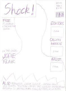
This is a flat plan for an alternative cover that I could have done. However, I chose not to choose this cover and name. This is because I felt that the layout of my other plan was more effective. I also thought that the name "IVM" fitted better with the indie genre that my magazine is taking, as the name "shock" sounds like more of a name that would be given to a metal magazine. Also, the fact that the title of the magazine overlapped the photo of the main cover artist was a flaw, as usually in magazines as little as the photo is covered up as possible. Also, in this flat plan, I had planned to do a facial shot of the cover star, but in my other one I am planning to do a mid/long shot which shows the style of clothing that the artist is wearing. This will appeal to the target audience of the magazine, as they will be looking out for new, indie fashions, which is what the cover star will be dressed in. Also, I felt that the strap line at the bottom took up too much of the article, and cut off valuable space that I could have used for the main sells and the cover photo. Finally, on this plan there was a lot of blank space, and I felt that the design of my other cover, with having two of the main sells on each side, worked better at using space on the cover and spreading the articles out. I had to consider my target audience, and what would appeal to them more, and overall I felt that the other design did this.
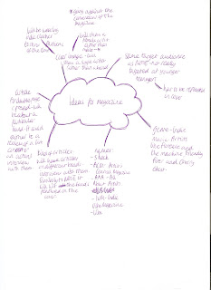
Brainstorming ideas
Monday, 9 November 2009
Flat plan for cover


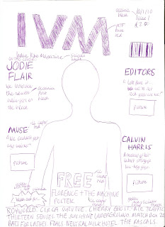
This is the flatplan for the cover of my magazine, IVM. In the cover, I have chosen a bold font for the title of the magazine. I have also chosen for it to be red, as I think this is a bright, bold colour that will highlight it on the page. This is typical of most magazines: to use a bright bold font for the name of the magazine, to catch people's eye. This kind of style for my title would appeal to my target audience as they would like to be able to find the title of magazine quickly and easily when searching through a whole selection of music magazines.
For my tagline, I have chosen a relatively small black font, as I feel that it is not a very important piece of information on the cover: it only says the full title of the magazine (Indie Vibe Magazine). This conforms and rejects conventions of magazine design, as for some magazines the tagline is very important (e.g. Kerrang's tagline-Life is loud). However, for some abbreviated names like NME I think that they, like I have, put less focus on it. This would appeal to my target audience as it will not be an important piece of information for them, and many of them will just call it by its shortened abbreviation anyway.
I have chosen to put the important information like date, issue and price in the left hand corner, where it is clear and easy to read. Although I have not chosen to use a massive bold font, I think it fits in well with design and will still be easily read. In some ways this is similar to magazine conventions as some magazines put information like this very clearly in the top left corner like I have. Some magazines like NME, however, but the information very small in the bottom left hand corner. I felt that for my magazine, it was suitable, and would appeal to my target audience to put it there, as it would be a new magazine and people would want to know the price straight away.
I have placed my barcode in the top right hand corner with all the other information, as I felt it would be useful to group it all together. However, I have made sure that it does not detract from the design and other elements of the cover. This conforms to magazine conventions as all magazines will try to put the barcode in a subtle place on the cover, so people can focus on other parts of it. This would appeal to my target audience as the barcode would not a particularly important element on the magazine to them.
For my main flash, I have placed it in the near the top on the left hand side. I felt this was a good place for it as it is easily noticed but at the same time does not overlap the picture too much. I also chose a bold font, LL cooper, in the colour red, as I felt that this would really help to draw attention to the band in the article, and if they wanted to they could read more about the article beneath it. For the information about the main sell I used the font oceania as it is quite subtle but would still be easily seen against the background that I have chosen. I also used a bigger font for the main flash than the other main sells, to show that it is the most important article on the cover. This conforms to magazine conventions but also rejects them. For example, having the main flash on the right near the top of the magazine is not common for most magazines, as they usually put the main flash in the centre at the bottom of the page. However it also conforms to certain conventions, for example using a different colour font for the title of the main flash and also using a bigger font than the main sells. I think that having this kind of style for the main flash would appeal to the target audience, as they would want to be able to find it easily on the cover and would want it to be read easily.
I have spread my main sells around the cover, with two on one side and one on the other. I think that this layout will work as it fills up more of the cover, as opposed to having all the main sells on one side and the main flash on the other. I have also made the main sells smaller than the main flash, and that is to show that they are just highlighted articles and not the main article on the cover image. However, I have still made them big enough so they can be easily read. I have used the same text and colour style for the main sells as I have the main flash, and this is because it is simple but will also make them stand out. However, there is a difference in the information about the flash, as underneath the band name on the main sells I have included a quote from the band, rather than an introduction to the artist. This is because the artists on the main sells are not new artists, but the cover artist will be. There will also be a small picture of each of the bands underneath the main sell, and that is to introduce the band's particular image to the reader, and also show them what they look like if they have never seen them before. In some ways this goes with magazine conventions but in others it doesn't.
The fact that I have made the main sells smaller than the main flash, but have used the same fonts and colour scheme goes with magazine conventions, as many magazines do this. Also, the fact that I have used quotes under the names of the bands for my main sells conforms to magazine conventions, as these techniques are used regularly in music magazines. However, the fact that I have included a picture for each one of the main sells goes against magazine conventions, as most magazines do not include a picture for every single main sell e.g. NME only uses a picture for a highlighted article on the cover. I think that having these different elements in my main sells will appeal to my target audience as they will like the fact that if they do not know the band on the cover by name they may be able to recognise them from the picture. They will also like the fact that the main sells are clear and easy to read.
I have included a strap line at the bottom of my cover to advertise other bands that will feature in the magazine. I put the strapline on a yellow background, and used the font sciallo in black. This is a bold font, which will make them stand out on the page, as the other artists featured are an important element on the cover. I have also included a yellow text box in the shape of an explosion saying "look out for". This again helps to highlight the strapline as an important piece of information. The fact that I have included a strapline conforms to magazine conventions as many music magazines e.g. NME, Kerrang, use one of these. The fact that I have included the text box also conforms to magazine conventions, as having text boxes to highlight certain pieces of text is common in most magazines. Having the strapline and making it bold and clear will appeal to my target audience as they will want to know what other artists are featured in the magazine before they buy it, and will want to be able to find this quickly.
Finally, I have included an advert for a separate free giveaway, near the bottom of the cover, at the centre of the page. Having it here will draw people's attention to it. I have put the word "free" in a bold capital font (ll cooper) and the rest of the advert also in the same font, but smaller. Having an advert for a separate giveaway on the cover in a prominent place conforms to magazine conventions, as many magazines would do this to make sure attention is drawn towards it. However, in other ways, placing the advert here is not common in magazines, as a lot of the time the main flash is put there. Having an advert on the front cover in a prominent place, and in a bold font would appeal to the target audience as it would be an important element in the magazine for them. Overall, my cover rejects and conforms to magazine conventions, but overall the design layout works and would appeal to the target audience in many different ways.
Tuesday, 3 November 2009
Fonts


I am in the process of deciding which fonts to use for my music magazine. I have looked on dafont.com and have come up with a list of several that I think would fit with the style of my magazine. The reason I have chosen these fonts as I think that they fit with the kind of target audience that I am aiming my magazine towards.
I chose the font "mtf base" as I thought it would look good for the title of my magazine. It is bold and has been outlined, which would make sure that it looked like a focal point on the page. I chose the font "shock" as I think it is fun and funky, and fits with the target audience. I think it would look good for the title of my main article on the double page spread. It is also a fun font that will appeal to the target audience, but at the same time make writing stand out. I have chosen the font "sciallo" as I think that it would look good under the title to show its full meaning (indie vibe magazine). Also, because it is not too bold it would not stand out too much on the cover and would just fit in with the overall style of the cover. I have chosen to use the font "oceania" as it is quite an ordinary, basic font that would be good for basic text in the articles e.g. the main article in the magazine and the preview part of the main sells. Finally, I have chosen the font "LL cooper" as I think it would be good for the titles of the main sells and makes them stand out on the page. Also, I think that it is clear and easy to read, but also has a funky edge to it.
I asked my target audience what they thought of my font choices. These included some of people in my class. They thought that the fonts worked well for each of their uses. However, they said that I had used a maximum numbers of fonts on the page, and if I had used any more it would look too crowded and over the top. I would agree with this, as looking at a lot of magazines and magazine covers I can see that they try to use a minimal number of font choices, and this makes their magazines look professional. However, I mostly got good feedback from my target audience, and they felt that the fonts I had chosen fitted with my target audience as they were easy to read, but still fun and interesting, rather than being plain and boring. This is what my target audience would look for in a front cover.
In the making of my magazine, the amount of fonts that I used decreased. I decided not to use the fonts "shock", "ll cooper" and "sciallo", as I found that they were not very bold and did not show up clearly on my magazine. I substituted these with a new font, "arial rounded MT bold", which I simply used for my pull quote on the double page spread and the title on the double page spread. I chose it as it was bold but simple at the same time.
Overall, I am pleased with the font choices that I made, and feel that they fit with the style and target audience of my magazine and look effective.
Friday, 23 October 2009
Analysis of a double page spread
I have analysed an article from NME magazine on "The Teenagers".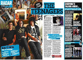 The language use and tone are very important in showing the target audience in this magazine. Firstly, the article uses very sexual language, which helps to connote the kind of audience that they are targeting at, and also fits with the theme of the other article on the spread-a band with "filthy tunes". This kind of language is very ordinary and colloquial, and gives the article a friendly, relaxed tone, as this is how people would talk in everyday life. This shows the reader that the article is not a particularly serious, in depth one. The article as a whole uses very relaxed, everyday language, to make the reader feel at home. Another part of the spread with sexual connotations is: "the bands stroking our undercarriage and giving us a warm feeling this week". This helps to show that the magazine has an older audience, and is not based at 13 year olds and younger teenagers. Also, there is a caption saying "need to know". This kind of language is used in the article to entice you into reading it, and showing it is important to understanding the article a bit more. Finally, where there is a quote from the band in the middle of the page. Casual language is used in this. This is used to help show the reader that the people in the band are just ordinary people, and the quote also helps to show that they relate to teenagers and people who aren't their own age-"Of course we're a sexual band. We're The Teenagers and that's all they think about".
Five images are used in this double page spread, and they definitely dominate the article, which has a limited amount of text. This is because images make the page more interesting, and help to show a bit more of what the article is about. There is one main image on the page and a smaller image, which shows the band in the main interview. This image creates a certain mise-en-scene, and again helps to suggest the target audience of the article. It shows the band lying casually on a sofa, and they are all in very relaxed positions. This helps to suggest that the band are just everyday people, and are not upper class or snobby. The clothes the band are wearing are all black, which helps to suggest the genre of their music. Also, they are all wearing fairly fashionable clothes, and this will interest readers as it is showing them fashions of the time. The members of the band are wearing fake glasses, which make them look stereotypically "nerdy". This helps to suggest to readers that they are just ordinary people that you can relate to. The background in the photo looks quite upper class, however the photos on the wall contradict with this. There are very sexual images of women plastered all over the wall, and this again helps to suggest the sexual nature of their music. This kind of setting helps to show the target audience, as they may be able to relate to these kind of settings, especially if they are someone like a student at university. There are also three mini images on the spread of other bands. These relate to a side article on the spread called "Everyone's talking about". This mini-article gives reviews of up and coming bands that are not yet well known. The images show the bands in dirty, raw settings like council estates, and this helps to suggest the nature of their music and also the fact that anyone can read NME.
The article has used a pull quote from the band, and it is highlighted in a blue label, which makes it stand out from the rest of the article. The photographs on the spread do not really have captions, as the images themselves are pretty self explanatory, and do not need a caption. However, there is a caption for one of the images. The first paragraph of the article is not in bold, and this is maybe to stop people just reading one paragraph, and encourage them to read the whole article. However, the article does start with a drop capital of the first letter, "T", which helps to make the first word stand out on the page, and entice you into reading the article. The article in this double page spread has used a different colour scheme of black and blue, which provides a bit more interest to the magazine. Text boxes are used for important bits of information of the article, for example quotes, a fact file, and the contents page heading it comes under-"radar". A large separate text box has been used for the side article on the spread, to separate it from the main one.
Overall, the double page spread is very good at targeting its target audience both in its language use, and its easy layout. The target audience would like a clear layout on the page so they can find information easily.
 The language use and tone are very important in showing the target audience in this magazine. Firstly, the article uses very sexual language, which helps to connote the kind of audience that they are targeting at, and also fits with the theme of the other article on the spread-a band with "filthy tunes". This kind of language is very ordinary and colloquial, and gives the article a friendly, relaxed tone, as this is how people would talk in everyday life. This shows the reader that the article is not a particularly serious, in depth one. The article as a whole uses very relaxed, everyday language, to make the reader feel at home. Another part of the spread with sexual connotations is: "the bands stroking our undercarriage and giving us a warm feeling this week". This helps to show that the magazine has an older audience, and is not based at 13 year olds and younger teenagers. Also, there is a caption saying "need to know". This kind of language is used in the article to entice you into reading it, and showing it is important to understanding the article a bit more. Finally, where there is a quote from the band in the middle of the page. Casual language is used in this. This is used to help show the reader that the people in the band are just ordinary people, and the quote also helps to show that they relate to teenagers and people who aren't their own age-"Of course we're a sexual band. We're The Teenagers and that's all they think about".
Five images are used in this double page spread, and they definitely dominate the article, which has a limited amount of text. This is because images make the page more interesting, and help to show a bit more of what the article is about. There is one main image on the page and a smaller image, which shows the band in the main interview. This image creates a certain mise-en-scene, and again helps to suggest the target audience of the article. It shows the band lying casually on a sofa, and they are all in very relaxed positions. This helps to suggest that the band are just everyday people, and are not upper class or snobby. The clothes the band are wearing are all black, which helps to suggest the genre of their music. Also, they are all wearing fairly fashionable clothes, and this will interest readers as it is showing them fashions of the time. The members of the band are wearing fake glasses, which make them look stereotypically "nerdy". This helps to suggest to readers that they are just ordinary people that you can relate to. The background in the photo looks quite upper class, however the photos on the wall contradict with this. There are very sexual images of women plastered all over the wall, and this again helps to suggest the sexual nature of their music. This kind of setting helps to show the target audience, as they may be able to relate to these kind of settings, especially if they are someone like a student at university. There are also three mini images on the spread of other bands. These relate to a side article on the spread called "Everyone's talking about". This mini-article gives reviews of up and coming bands that are not yet well known. The images show the bands in dirty, raw settings like council estates, and this helps to suggest the nature of their music and also the fact that anyone can read NME.
The article has used a pull quote from the band, and it is highlighted in a blue label, which makes it stand out from the rest of the article. The photographs on the spread do not really have captions, as the images themselves are pretty self explanatory, and do not need a caption. However, there is a caption for one of the images. The first paragraph of the article is not in bold, and this is maybe to stop people just reading one paragraph, and encourage them to read the whole article. However, the article does start with a drop capital of the first letter, "T", which helps to make the first word stand out on the page, and entice you into reading the article. The article in this double page spread has used a different colour scheme of black and blue, which provides a bit more interest to the magazine. Text boxes are used for important bits of information of the article, for example quotes, a fact file, and the contents page heading it comes under-"radar". A large separate text box has been used for the side article on the spread, to separate it from the main one.
Overall, the double page spread is very good at targeting its target audience both in its language use, and its easy layout. The target audience would like a clear layout on the page so they can find information easily.
Analysis of a contents page
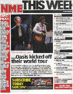
I have chosen to analyse an NME contents page, as it relates to my chosen genre of music magazine.
The structure of the contents page is very simple. Rather than having just a list of contents, it is split into different categories. For example, there are categories for "news","reviews" and "features". This makes the pages of the magazine a lot easier to find, and simplifies the process of finding a particular article. There is also a band index, which lists all the bands featuring in that particular issue. This is useful if someone is looking to see whether a particular band is in that issue. There are two medium sized images, but they do not dominate the whole of the page unlike the front cover. The images relate to a highlighted article, which is one that has not been shown on the front cover in any of the main sells. The fonts used are also different to the front cover, and they are reminiscent of fonts used in newspapers, however, the main NME emblem is the same as on the front cover, just to advertise the brand a bit more. The font colour scheme is generally the same, however, unlike the cover mainly black has been used for most of the text and red and yellow text are very minimal on the page. Red text boxes have been used which carry on with the theme of red throughout the magazine.
Overall, the contents page has a very newspaper style layout, which fits with the title New Musical Express, and would fit with audience expectations of the magazine.
Tuesday, 20 October 2009
Analysis of two music magazine front covers
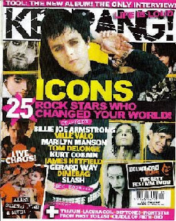
 I have chosen to analyse Kerrang and NME, as although they are not entirely similar genres, they both have similar features. In making my magazine however, it will be more similar in music styles to NME, rather than the heavy music that is shown in Kerrang.
The NME target audience is people aged 15-44, but mainly people in their 20s who are either in university, office workers or professionals. They will mainly be in the A, B and C1 classifications. They will also mainly be males. They will have interests like going to festivals and playing games. They will mainly be individualists who would want to be different by listening to music, or succeeders, who are people who are succeeding and would have the disposable income to buy the magazine. The Kerrang target audience is much younger-it targets people of ages 14-24. It mainly appeals to teenagers. They will mainly be males, however the pink on the cover suggests that the magazine is not all male-orientated. They will mainly be in the E classification, as they will be students at college or university. Their interests will be things like going to gigs, and gothic fashion. They will mainly be individualists: people who are wanting to be different by listening to heavy music instead of chart music.
The titles of the magazines are very different. NME has been given this name as I think that it gives it a more grown up edge compared to the name Kerrang. Also, the name makes it sound this way because it has a name similar to a newspaper, as it is still seen as a music paper-New Musical Express. This kind of name would appeal to the target audience as it sets the magazine apart from other magazines, and makes it seem more serious than other music magazines. The name Kerrang, however, is aimed at a different audience. They have chosen this name as it does now really mean anything, and is not a real word, so it gives the magazine a more fun edge than the name NME does.
The NME front cover is limited in its use of colour for text, however, the picture shows a range of different colours. The red colour of the title of the magazine, NME, really makes it stand out against the photo beneath it. Also, the fact that it has been outlined in both white and black, helps to make it a focal point on the cover. Another text colour that really stands out on the page is the yellow font, which helps to highlight the main flash as an important piece of text on the cover, and also helps to suggest happiness, as yellow is a bright sunny colour. Also, the fact that the yellow colour is used at the top to advertise headliners at Glastonbury that year helps to highlight it against the background. Blue boxes are also used for the headings of the main sells, and special articles e.g. "Blur R.I.P". This helps to make them be seen clearly, so you know that those bands are important in the magazine. It also helps to highlight particular parts of the main sells, as the rest of the text in the main sells is white. The text colours fit with the colours in the main image, as they are all colours that go together, and also because the colours in the picture are relatively dark, this allows the font colours to stand out more. These type of text colours appeal to the magazine's target audience, as they will want text that is bright and fun, but still easy to read. The Kerrang cover also uses colour in a very strong way. It uses pink to highlight certain parts of the text, such as the main flash and the tagline-"life is loud". The pink helps to suggest that the magazine is maybe more orientated towards a uni-sex audience, rather than a mostly male audience. Other font colours that are used are yellow and white, which stand out against the background, which is relatively dark. The yellow in the article is used to highlight names of bands and key words, which makes them clearer to read on the cover. Black text is used for the cover, and this helps to suggest the nature of the music (loud heavy metal) and also makes the title stand out against the plain white background. The text colours fit with the background colour, as black is mainly used in the background, which helps to make them stand out. Also, some yellow is used in the background, which matches one of the text colours. The use of many different colours of the Kerrang front cover would appeal to its target audience, as it makes it more interesting and appealing.The NME front cover uses about four fonts. Limiting the amount of fonts would appeal to the target audience as they would feel that it is not too overbearing and much easier to read. They use bold capital letters for things like the name of the magazine and the bands featuring in it. The main flash however, is all in lower case but it has been made bolder and is much bigger than any of the other information on the page. The fact that some of the writing in this is slightly tipped over and not straight on the page makes the article look more interesting. The other main sells use lower case for the information about them, and have not been made bold. This is maybe because the names of the bands mentioned in the head of the main sells are enough to tempt someone to read it, without having to look what it is about. Un-bold capitals are used for the caption underneath the title of the magazine, and that is because it is of little importance to the reader as most readers will know what the magazine stands for anyway. The use of different fonts and font styles would appeal to the target audience of this magazine, as they could find the important and interesting information on the cover quickly, and not have to focus on un-important information as well. The Kerrang cover uses a very limited amount of fonts: about three. Most of the information on the cover is all in one font, which is a bold font in capitals. However, some parts of text are made bolder than others, to highlight particular words and phrases, for example "icons" is made the boldest on the page. A smaller font is used for the names of more of the bands that will be appearing in the issue, but this writing is still very bold on the page. A different font is used for the caption of the magazine, and this is a very haphazard font. This helps to suggest the type of chaotic music that is in the magazine. Overall, the text on the Kerrang cover would appeal to its target audience as they would be able to find band names and important pieces of information on the cover quickly.
Both magazines have used language in a very simple way. In the NME cover, they have used quite informal, simple language, which is easy for the reader to understand. e.g. "silly". However, they also use quite specialist language which some people would not understand e.g. "ukulele". This is a music instrument that a lot of people may not have heard of. This kind of language would appeal to the target audience as they would like the language to be informal as it makes the magazine more welcoming. Also, the musical language would appeal to them as it helps to enforce that NME is a specialist music magazine, and is not all about ordinary chart music. Similarly the Kerrang cover has used very simple language, which is informal. It has also used a lot of informal punctuation like exclamation marks, to emphasise points e.g. "live chaos!". The Kerrang magazine also uses numbers to simplify the writing. The target audience of Kerrang would like the magazine to use this simple, informal language as again it makes the magazine seem more friendly, and is also easy to read and find out information quickly.
Images are very important on the covers of magazines. On the NME cover, images are used to show photos of bands, for example the band in the main flash, The Wombats. The Wombats are mainly a UK band, so therefore the magazine is not appealing to people internationally. They have chosen to have The Wombats on the front cover as they are not big international stars, which helps to suggest that the magazine is all about the indie music scene, rather than the mainstream. Also, the fact that the images on the cover are all of males helps to suggest that the magazine is targeted at a male audience. The clothes that the bands and artists are wearing are important, as they help to show a style for the readers of the magazine, and suggest what kinds of fashions are around for more individual people. The bright, old fashioned shirts and girls jewellery help to make the cover look a lot brighter. The people in the image look like they are having fun and just posing: one of the band is jumping in the air, the other is pulling his hair so it sticks up, and the other is doing a mock shocked face. None of the people in the image are smiling, which helps to suggest that the band being featured are cool, and also that the magazine is a high class music magazine. The images on the cover would appeal to the target audience as they help to show them a bit more about the bands and indie style. The Kerrange cover uses many images. None of these images are bright: they are either in very muted colours or black and white. This helps to show the dark aspect of the metal genre. They show the different artists featured on the cover. The main image is of Billie-Joe Armstrong, and he has been posed in a very moody fashion. This helps to suggest the type of music that will be featured in the magazine-moody rock music. The fact that he is from Greenday, a huge international band, helps to suggest that the magazine has an international audience. They have chosen to have him as the main image as he would help to attract more readers. By the make-up and the clothes that they are wearing, the reader can learn a bit more about the band/artist's personality, and also learn more about fashions for people who like a more heavy metal genre. Overall, this would appeal to readers of Kerrang, as they are used to seeing metal artists dressed like this, and would find them useful in seeing change in a band or current fashions for the particular genre.
The NME magazine has a fairly standard layout. It has the photo of the band in the main flash taking up the whole of the cover, with a banner about other artists featured both at the top and bottom of the cover. The main flash is placed in the centre of the cover, and this makes it easy to see. The main flash is about a particular band, The Wombats, and contains an interview with them. The main sells are on both the right and left hand side of the cover. The main sells of the article are about individual bands: Muse, The Cribs, Blur and Panic At The Disco. These kind of main sells and the main flash would appeal to the target audience as they will be reading the magazine because of the interviews, to get a more personal look at different bands. The title is in the top right hand corner, however, as the font is so bold on it it still stands out on the page. Other information presented is things like the barcode, price, date and issue, and these are placed in the bottom right hand corner, as they expect regular readers of the magazine to know things like the price without them having to look too hard. Overall, this layout would appeal to the target audience as it is easy and simple to read, which would help when trying to find out information about a certain article. The Kerrang cover has a slightly different layout. There is a banner both at the top and bottom of the cover displaying important information about bands etc. The main photo on the cover is placed over the title, which is at the top of the cover, as the magazine is so well know you do not need to see all of it. The main photo takes up most of the page, however there are many photos on the right and left hand side of the cover that overlap it. The main flash is placed at the centre of the cover, which draws attention to it straight away. It is a list of rock icons. The main sells are placed to the side of this, with the photos of other artists. These are about individual artists or bands, and are generally interviews with them. Overall, this kind of layout would appeal to the target audience of Kerrang, as it is very chaotic, and suggests the chaotic music inside the magazine.
Target audience for music magazine
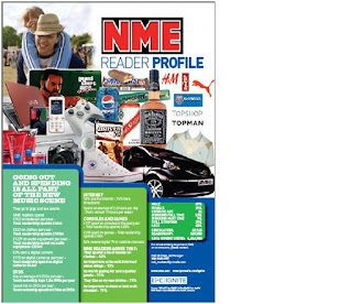
I have based these ideas on the NME readership details per issue. A total of 388,000 adults read NME per issue. 250,000 people of the socio-economic groups A, B and C1 read the magazine per issue. People of A, B and C1 groups are people like high ranking professionals, middle ranking professionals and "white collar" (office) workers. There were 137,000 readers from the C2, D and E socio-economic groups. These groups are people like skilled manual workers, semi and unskilled manual workers and people getting state benefits. 339,000 of the readers were from the age group of 15-44. Only 49,000 of the 45+ age range were readers. In total 296,000 of the readers were men. 91,000 of the readers were female. These results show that the general the average reader is a male in the A, B or C1 socio economic group, and is generally between 15-44 years of age. The link for where I found this information is: http://www.nrs.co.uk/toplinereadership.html, in general magazines.
I have also based my target audience on the readership profile of NME. It showed mostly male items like phones, cars and trainers. It also showed pictures of things like festivals, topman clothes and hairgel. However, the fact that topshop is shown on the readership profile suggests that girls are also targeted to read the magazine. The information shown says that 69% of the readers are male, and 31% female. It also says the average age of readers is 24. There are also statistics about how much they spend on clothes, dvds, games and how much time they spend on the internet. Their results showed that 94% of readers used the internet. Therefore, the general reader is a male, who is of the average age of about 24. They are interested in games and fashion, and also enjoy going to music festivals and gigs. I will use these results to form my own target audience.
Using NRS I have also looked at what the target audience for Kerrang. A total of 417,000 adults read Kerrang. 239,000 of these were in the A, B and C1 categories. These are people like high flying professionals and office workers. 178,000 of these were in the C2, D and E categories. These are people like skilled and unskilled manual workers, students and the unemployed. 339,000 were in the age range 15-44, but only 49,000 were aged 45+. This shows that Kerrang magazine has a much younger audience, and doesn't really have any appeal to the older generation. A total of 290,000 of the readers were men, and 127,000 were women. Using this data I can see that Kerrang magazine is mainly targeted at young people between the ages of 15-30. I can also see that although the main gender target is men, it also appeals to women as it has a lot more female readers, compared to NME. The majority of readers were in the A, B and C1 socio economic groups, as they would have the disposal income to buy the magazine.
I have decided to use the same target audience as NME. Using the demographics that we have learnt in class, and looking at readership details and the readership profile for NME I have decided on my target audience. My target audience are going to be in the A, B and C1 socio-economic classification as most of them will be professionals, around the age of 24. They will be aged 15-44 in general; however, there will be a small percentage of older readers. Similarly, although most of the readers will be male, a small majority will be female. In psychographic terms, they will generally be individualists, who are people who are wanting to be different. They may also be succeeders, who have enough money to buy the magazine regularly, but do not need to show off their wealth to other people. They will read this magazine as they will want to be different by listening to different music, and going against the normal pop music that is on offer. They will shop at clothes shops like topshop and topman, and will often go to festivals and gigs like Reading, which is not aimed at teens. Also, they will play computer games, and use the internet regularly, but will not have a huge interest in movies. Overall, I think that the readership profile I have created really fits with the style of magazine I have designed, and the magazine would be something that my target audience would be interested in buying.
Introduction for final coursework
Our task for the coursework is to design and create a front cover, contents page and double page spread for a music magazine. The magazine has to be aimed at a particular genre, for example, it may be aimed at pop readers or more indie readers. My magazine will be aimed at more indie readers, as this is the kind of music I am into, with artists like Florence and the Machine and Friendly Fires. This main task is a development of my skills learnt from the preliminary task, so therefore I am more familiar with the InDesign software.
Monday, 19 October 2009
Final Contents Page Layout
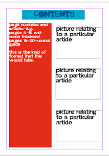 This is my final contents page design. I asked members of my class about it to get feedback from my target audience. They felt that the good parts of it were that it was simple and easy to read. However, some people thought that the layout could have been improved by making it a bit more individual. Overall, however, the feedback was good. I will take it into account when creating my completed contents page for my coursework.
I think my contents page layout has also worked out well. Although it is simple, it works effectively. This is because if a simple contents page is used, people will be able to find information on it easily, and also will be used to the layout as this is the standard contents layout for most magazines. However, I think that some areas of it could have been improved. For example, I think that I could have used different fonts from the ones used on my front cover, as this would have provided a bit more variety. I also think that although the layout is simple, it could have been made a bit more out of the ordinary e.g. with boxes on different angles. This may have made it more interesting. Overall, however, I think that the style of the contents page fits with the nature of the magazine, which makes it very effective.
Thursday, 15 October 2009
Flat Plans
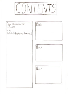
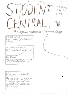
These are the flat plans for my front cover. Firstly, I chose to use a bold, capital font for the masthead, called Malgecito. I have done this as I wanted the title to stand out in the magazine. I decided to use another simple font for the rest of the text called Soolidium, as it was simple, but at the same time a trendier font as it is for a student magazine. Also, it could be easily seen on the page. The fact that I have chosen to use only two fonts, and the types of fonts I have used will appeal to my target audience as they are bright and bold and also fit with the trendy layout of the magazine cover. For my masthead, I also decided to use a bright blue font, which stands out against the rest of the text and the photo on the magazine. I think this would appeal to my target audience, which is students of the college, as they will like to have a title that will be bold and easy to read but at the same time looks good. I have tried to use very exciting language and punctuation on the front cover, to entice the reader. However, at the same time the language is simple, as I want it to appeal to all types of students, not just intellectual people. For example, in the main flash I have tried to include this language- "The new students for Autumn '09 are here again!". I have used exclamation marks to grab the readers attention and make the article sound more interesting, but at the same time I have not used language that is complex. This kind of language would appeal to my target audience as they would be put off if the magazine used very formal language, and would find the simple, friendly language more approachable. I have also included this kind of language in my main sells e.g. "You can party and get your work done!". This makes the magazine sound approachable as this is how young people would speak-in an informal way. Another main sell that used a different type of language was this "Do you know whether you've chosen the right course for you?". The language in this main sell is meant to sound friendly and welcoming, as if students feel that they are not on the right course they will be feeling stressed. This type of language would appeal to the target audience as it makes the reader feel welcome. Also, as it is a rhetorical question, it makes the magazine feel more personal, as if the question is aimed at the reader. I have included important information like the date, issue and price in the top hand corner as it is the usual layout for this information to be. Also, it can be easily seen on the magazine, and I have tried to make it stand out as much as possible. This would appeal to the target audience as they would like the magazine to stick to the usual format, so they could find the price easily, and would like it to be easy to read and clear. The layout of my contents page is fairly simple. I have made the heading of the contents in bold capitals, and very large on the page, and this would appeal to my target audience as they would like to be able to know what the contents page was quickly and easily. I have out all the page numbers and articles on the left hand side of the page, as this is the usual format for a contents page, and teenagers would like this as they are familiar with it and would be able to find articles easily. Finally, I have included photos relating to the articles on the right hand side of the contents page, as this provides a bit more interest to it and also shows people a bit more about the articles. This would appeal to teenagers, as if they were interested in a particular article, but did not know what it was about, they may be able to see a relating photo to it and understand a bit more about it. Overall, I think that all my design choices have been reflected in my target audience, as my magazine would definitely appeal to my target audience.
Subscribe to:
Comments (Atom)
