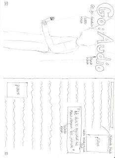

I also had to consider my target audience when designing my double page spread. The title of the article, the name of the band, is in a new font that has not been used before in my magazine: shock. I thought that this font went well with the style of magazine. The title of the article will be very big and bold, and take up the top of one page of the spread, in a black font. There will also be a tagline underneath the title, in the font sciallo. Having the title just the name of the band conforms to music magazine conventions, as many music magazines use this technique e.g. NME. Also having a tagline underneath the title is similar to many magazines, as it provides a bit more interest to the article. Having the title of the article in black rejects usual conventions as usually magazines would use a different colour for the title, but I felt that the colour black makes the article a bit more edgy and fits with the band's style of music. Having a big, bold title and a tagline would appeal to the target audience, as that is what they expect out of a music article, and will also add more interest to the relatively boring title. Also on this side of the spread is a picture of the lead singer of Go:Audio, which will take up the whole page. Having the photo of the band taking up one whole page of the spread rejects and conforms to magazine conventions, as some double page spreads in magazines (like one about "The teenagers" in NME) have whole photos taking up one side of the spread, however, other magazines may have smaller photos, as the articles may be a lot more in depth. This would appeal to the target audience as it allows for the reader to see clearly what the band actually look like, and give an insight into their personality. Finally, on the spread I have included text boxes which say the page numbers. This conforms to magazine conventions, as all magazines have to display these as they are important information. The target audience would like the fact that the article has page numbers, as all magazines have them, and it would allow the article to be found easily. I have also included a banner at the top of the other page of the article, and this will say things like the name of the magazine and their website. This is to reinforce and advertise the brand. This conforms to many magazine conventions, as many magazine include a banner to advertise this information, however, having it at the top of the page instead of the bottom makes it slightly different from other magazines. The main font of the article will be oceania, a sans serif font, and in the colour black, as this will allow it to be subtle, but also not so small it is hard to read. This conforms to magazine conventions, as all magazines try to have the main text in the article in a sans serif font, so it does not look to complicated or over the top. This would appeal to the target audience as they will want to be able to read the font of the article clearly. I have also included two smaller pictures on the article, to give people a bit more of an idea about what the band look like. This conforms to magazine conventions, as most magazine articles contain smaller images of the band, as well as the big main image. This would appeal to the target audience as it would allow them to see what other members of the band look like, not just the lead singer. I have chosen to have a plain white background, as this is simple, and will help to focus people's attention more on the article. This conforms to magazine conventions, as most of the articles I have read use a plain white background to make images and text stand out. This would appeal to the target audience as the page will not look too complicated and the text will be easily read. Finally, I have used a pull quote in a text box, to help the audience to see a bit more about the band, and make the article more interesting. I have used a different font from the main body of the article as this will make it stand out more, as it is a lot bolder (sciallo). This conforms to magazine conventions, as most magazines use pull quotes in interviews as they are very bold on the page, and can entice someone into reading an article. This would appeal to the target audience as they would want to know more about the band and see what they are like before reading. Overall, my double page spread appeals to my target audience, even if it does reject some magazine conventions. I am pleased with all my flat plans, and feel that they are detailed enough to be able to form my magazine effectively.
No comments:
Post a Comment