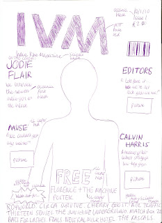


This is the flatplan for the cover of my magazine, IVM. In the cover, I have chosen a bold font for the title of the magazine. I have also chosen for it to be red, as I think this is a bright, bold colour that will highlight it on the page. This is typical of most magazines: to use a bright bold font for the name of the magazine, to catch people's eye. This kind of style for my title would appeal to my target audience as they would like to be able to find the title of magazine quickly and easily when searching through a whole selection of music magazines.
For my tagline, I have chosen a relatively small black font, as I feel that it is not a very important piece of information on the cover: it only says the full title of the magazine (Indie Vibe Magazine). This conforms and rejects conventions of magazine design, as for some magazines the tagline is very important (e.g. Kerrang's tagline-Life is loud). However, for some abbreviated names like NME I think that they, like I have, put less focus on it. This would appeal to my target audience as it will not be an important piece of information for them, and many of them will just call it by its shortened abbreviation anyway.
I have chosen to put the important information like date, issue and price in the left hand corner, where it is clear and easy to read. Although I have not chosen to use a massive bold font, I think it fits in well with design and will still be easily read. In some ways this is similar to magazine conventions as some magazines put information like this very clearly in the top left corner like I have. Some magazines like NME, however, but the information very small in the bottom left hand corner. I felt that for my magazine, it was suitable, and would appeal to my target audience to put it there, as it would be a new magazine and people would want to know the price straight away.
I have placed my barcode in the top right hand corner with all the other information, as I felt it would be useful to group it all together. However, I have made sure that it does not detract from the design and other elements of the cover. This conforms to magazine conventions as all magazines will try to put the barcode in a subtle place on the cover, so people can focus on other parts of it. This would appeal to my target audience as the barcode would not a particularly important element on the magazine to them.
For my main flash, I have placed it in the near the top on the left hand side. I felt this was a good place for it as it is easily noticed but at the same time does not overlap the picture too much. I also chose a bold font, LL cooper, in the colour red, as I felt that this would really help to draw attention to the band in the article, and if they wanted to they could read more about the article beneath it. For the information about the main sell I used the font oceania as it is quite subtle but would still be easily seen against the background that I have chosen. I also used a bigger font for the main flash than the other main sells, to show that it is the most important article on the cover. This conforms to magazine conventions but also rejects them. For example, having the main flash on the right near the top of the magazine is not common for most magazines, as they usually put the main flash in the centre at the bottom of the page. However it also conforms to certain conventions, for example using a different colour font for the title of the main flash and also using a bigger font than the main sells. I think that having this kind of style for the main flash would appeal to the target audience, as they would want to be able to find it easily on the cover and would want it to be read easily.
I have spread my main sells around the cover, with two on one side and one on the other. I think that this layout will work as it fills up more of the cover, as opposed to having all the main sells on one side and the main flash on the other. I have also made the main sells smaller than the main flash, and that is to show that they are just highlighted articles and not the main article on the cover image. However, I have still made them big enough so they can be easily read. I have used the same text and colour style for the main sells as I have the main flash, and this is because it is simple but will also make them stand out. However, there is a difference in the information about the flash, as underneath the band name on the main sells I have included a quote from the band, rather than an introduction to the artist. This is because the artists on the main sells are not new artists, but the cover artist will be. There will also be a small picture of each of the bands underneath the main sell, and that is to introduce the band's particular image to the reader, and also show them what they look like if they have never seen them before. In some ways this goes with magazine conventions but in others it doesn't.
The fact that I have made the main sells smaller than the main flash, but have used the same fonts and colour scheme goes with magazine conventions, as many magazines do this. Also, the fact that I have used quotes under the names of the bands for my main sells conforms to magazine conventions, as these techniques are used regularly in music magazines. However, the fact that I have included a picture for each one of the main sells goes against magazine conventions, as most magazines do not include a picture for every single main sell e.g. NME only uses a picture for a highlighted article on the cover. I think that having these different elements in my main sells will appeal to my target audience as they will like the fact that if they do not know the band on the cover by name they may be able to recognise them from the picture. They will also like the fact that the main sells are clear and easy to read.
I have included a strap line at the bottom of my cover to advertise other bands that will feature in the magazine. I put the strapline on a yellow background, and used the font sciallo in black. This is a bold font, which will make them stand out on the page, as the other artists featured are an important element on the cover. I have also included a yellow text box in the shape of an explosion saying "look out for". This again helps to highlight the strapline as an important piece of information. The fact that I have included a strapline conforms to magazine conventions as many music magazines e.g. NME, Kerrang, use one of these. The fact that I have included the text box also conforms to magazine conventions, as having text boxes to highlight certain pieces of text is common in most magazines. Having the strapline and making it bold and clear will appeal to my target audience as they will want to know what other artists are featured in the magazine before they buy it, and will want to be able to find this quickly.
Finally, I have included an advert for a separate free giveaway, near the bottom of the cover, at the centre of the page. Having it here will draw people's attention to it. I have put the word "free" in a bold capital font (ll cooper) and the rest of the advert also in the same font, but smaller. Having an advert for a separate giveaway on the cover in a prominent place conforms to magazine conventions, as many magazines would do this to make sure attention is drawn towards it. However, in other ways, placing the advert here is not common in magazines, as a lot of the time the main flash is put there. Having an advert on the front cover in a prominent place, and in a bold font would appeal to the target audience as it would be an important element in the magazine for them. Overall, my cover rejects and conforms to magazine conventions, but overall the design layout works and would appeal to the target audience in many different ways.
No comments:
Post a Comment