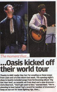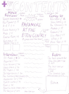


For my contents page, I have chosen my designs based on what my target audience would want out of one. For the title, saying "contents" I have chosen to use the same font and colour to the one used for the title of the magazine-mtf base in red. The title will also be in a large size, so the audience can be clear about what page they are on. This conforms to magazine conventions as most magazines have a title at the top saying "contents". However, some magazines do not do this, like NME, which just says "this week". I felt it would be clearer to make sure that people knew exactly what the page was. I think this would appeal to the target audience as they may want to be able to quickly find the contents page, so they can find a specific article. I have split the contents page into four sections, "reviews", "interviews", "coming up" and "retro". For the titles of these different sections I have used the font sciallo in black. I have also made them bigger than the information about the actual pages, as it will allow people to find a particular section of the magazine easily. For the page information and numbers I used the font oceania in black, as this is going to be the font for all the main text in my magazine. In the information about the pages, for three of the sections I have only put the name of the band it is about, as I think that that is all the information you need to know if you are wanting to read the article anyway. However, for the "retro" section at the end of the magazine I have used the names of the actual articles, as it is a specific section which only has three articles, and people would want to know more about it. In some ways these design ideas conform to magazine conventions, but in others they don't. The idea of having the contents page in sections is a technique that is used often in music magazines, to break up the contents page a bit more. Also the idea of having the titles of these sections in a bigger font than the information is used often, for example in NME. Also, having the names of only the bands to give information in the contents page is used a lot in music magazines, such as NME, as there is very limited space in a contents page. However, the idea of having a "retro" section at the end, with only three articles, rejects usual magazine conventions, as usually the sections would be easily spaced out and all the same length. However, I felt that this section would be the least important to readers, but they would still find it interesting, so I decided to include it in the magazine. Also, it would appeal to the older readers of the magazine. Having the contents page split into different sections would appeal to my target audience as they would want to be able to find information easily and quickly. Also, having only the names of bands for page information would appeal to the target audience, as it would allow them to look for a specific band quickly. Finally, the idea of having a retro section would appeal to the target audience, as they would want a bit of variety when reading the magazine. I have included pictures relating to certain articles in the contents page, and these will show people a bit more about the article and make the contents page more interesting. The idea of having pictures about certain articles conforms to magazine conventions as basically all magazines do this, but music magazines especially. This would appeal to the target audience as it would allow them to see a bit more about a specific article. I have also included a "highlight" article, on Paramore doing a concert. I felt that this would draw more attention to the contents page. For this I used the fonts sciallo, oceania and ll cooper. I made the title of the article red, to go with the colour scheme, and draw attention to it. I have included a text box saying "highlight", which will draw people's attention towards the article, as the text box is in the shape of an explosion and will be yellow. There will also be a large picture to go with the article, to show a bit more about what it is about. It conforms to many conventions of music magazine, as many magazines do use these highlight articles in their contents page, for example NME had a highlight article on Oasis. The idea of having the title of the article red also conforms to magazine conventions, as many magazines use bright colours to highlight titles. Having this article in the contents page would appeal to the target audience as it helps to make the contents page more interesting, and could help them to decide whether they want to read the full article or not. I have included the website address for the magazine at the bottom of the contents page. This conforms to magazine conventions, as almost every magazine will try to advertise their website, and the contents page is one of the best places to do it. Having the address in the contents page will appeal to the target audience as it is in an obvious place, and they will be able to find it quickly. Finally I have included information about a separate "freebie" in the top left hand corner of the contents page. This helps to show that it is not the most important piece of information on the page, but can still be seen clearly. With this article I have included a giant "+" sign, which draws more attention to it. The conforms to magazine conventions as a lot of magazines use a plus sign to draw attention to a certain article or groups of articles. Having it in the left hand corner, however, rejects magazine conventions, however I think it will be bold enough to be seen. It appeals to the target audience as it is clear and easy to see, but at the same time does not get in the way of page listings for other articles. Overall, I think that my contents page conforms and rejects certain magazine conventions, but the layout of it definitely appeals to my target audience.
No comments:
Post a Comment