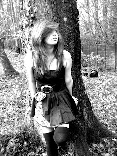

This is my cover image. For this image I decided to change it into black and white. I chose this as I felt that this was not typical for a magazine cover, and did not conform to usual stereotypes. This would then help to emphasise the fact that the magazine is an indie magazine. Also, I chose to put it in black and white as I felt that this would make the image a lot more effective and authentic. I also changed the brightness and contrast of the photo. This made it look a lot more professional and just generally improved the quality of the photo. It made certain things on the image stand out, for example the dress the tree and the bucket. I felt that having it more contrasted gave it a more magical, fairylike setting and made it look less real.
This is how I did it:
To change it to black and white I clicked "Image" and then "adjustments" and then "black and white and it put the image into black and white for me. It put it onto the default black and white setting. I then went on to "image" and "brightness and contrast" and set the levels to this: brightness -6, contrast 79. The image editing was then complete.
No comments:
Post a Comment