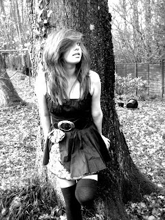
 I have chosen this photo as my cover photo. I chose this because I felt that it was the strongest photo in showing the genre of the artists music, through the clothes and the setting it portrays (the mise-en-scene of the photo). Having her wearing an individual dress helps to connote the fact that she is not a typical "pop star" and that she has some authenticity and individuality about her. Also, I thought that the setting went with her style of magazine as she will be an artist who has a similar audience to "Florence and the machine". It helps to show the indie and natural nature of her music, as if the photos were taken in the city it would represent more of a street style of music. Her makeup I chose for her to wear also helps to connote her style of music. I had her wearing were heavy eye makeup, as I felt that this was a lot more individual than a lot of styles that other artists wear. I also styled her with big hair with lots if hairspray in it. I did this as most artists nowadays are always after pristine hair, and I felt that having her hair a bit more messy would help to show her indie image more, and show that she is not an artist that tries to conform to stereotypes. The pose she is doing is quite natural, and does not look forced at all. Also, it helps to appeal to men as the pose is showing a bit of her leg, but not too much and this will intrigue them as they will want to see more. All of these features of the photo help to show the genre of the magazine (indie), and help to highlight the fact that it does not conform to stereotypes of how a typical star should look. It also appeals to the target audience, which is mainly men, as it quite a sexy picture, showing an attractive artist. This may encourage them to buy the magazine, even if they do not usually. Overall, I am very happy with this cover photo.
Monday, 23 November 2009
Photos
 I have chosen this photo as my cover photo. I chose this because I felt that it was the strongest photo in showing the genre of the artists music, through the clothes and the setting it portrays (the mise-en-scene of the photo). Having her wearing an individual dress helps to connote the fact that she is not a typical "pop star" and that she has some authenticity and individuality about her. Also, I thought that the setting went with her style of magazine as she will be an artist who has a similar audience to "Florence and the machine". It helps to show the indie and natural nature of her music, as if the photos were taken in the city it would represent more of a street style of music. Her makeup I chose for her to wear also helps to connote her style of music. I had her wearing were heavy eye makeup, as I felt that this was a lot more individual than a lot of styles that other artists wear. I also styled her with big hair with lots if hairspray in it. I did this as most artists nowadays are always after pristine hair, and I felt that having her hair a bit more messy would help to show her indie image more, and show that she is not an artist that tries to conform to stereotypes. The pose she is doing is quite natural, and does not look forced at all. Also, it helps to appeal to men as the pose is showing a bit of her leg, but not too much and this will intrigue them as they will want to see more. All of these features of the photo help to show the genre of the magazine (indie), and help to highlight the fact that it does not conform to stereotypes of how a typical star should look. It also appeals to the target audience, which is mainly men, as it quite a sexy picture, showing an attractive artist. This may encourage them to buy the magazine, even if they do not usually. Overall, I am very happy with this cover photo.
Subscribe to:
Post Comments (Atom)
No comments:
Post a Comment