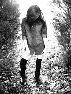
I have decided to use this photo as the main image of my double page spread. It will take up one half of the spread, as I feel that it is a strong image. I think that the mise-en-scene of this photo helps to emphasise the genre of the magazine and would appeal to the target audience. I chose the costume as it seems a very relaxed, casual outfit of a denim shirt, socks and ugg boots, but at the same time it also gives sex appeal as there is leg on show. Also, this kind of outfit is reminiscent to the iconic image of the woman in the shirt and socks playing guitar. You cannot see all of the artists face, but you can see that she is smiling. This then suggests that although she may have previously appeared moody, she does have a fun side to her. I think the pose that I have chosen is effective, as the way that she had her leg helps to show a more casual side to the star, as it is quite a casual pose. It also helps to give the photo sex appeal, by showing more leg. The subject of the photo is framed in the trees, and I think this is effective as it helps to emphasise the fact that she is the main subject in the photo. The setting is effective as it is quite a simple, natural setting, which just allows you to just focus on the girl in the photo. Overall, this image helps to show the genre of the magazine as it shows that it is an indie magazine, that does not take the usual close-up shots of artists like so many magazines do (e.g. magazines like "top of the pops" do this). Also, I think that another main reason for me choosing this image was the fact that it does appeal to the target audience, as it has subtle sex appeal, but it is not too in your face.
No comments:
Post a Comment