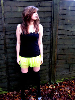
This is the final photo, which I will use in my contents page. This means that the image will be very small on the page. It is quite a simple photo, but I think it is quite effective. The outfit for the photo was fairly simple, just a black top, a tutu, socks and high heels, but I think it is effective in showing a different side to the artist. Before we had seen her in flowery dresses and denim shirts, but here the neon tutu helps to make the outfit seem more outrageous. It helps to show that the artist has a wacky side, and that her music is nor mainstream. The setting of the photo is fairly simple: against a green fence. I think that this is effective with the outfit I have chosen, and helps to emphasise the brightness of the tutu and the wackiness of the artists outfit. Finally, I have chosen to portray a very simple pose. This contrasts with the bright outfit, and I think makes the artist seem more real. As she is gazing into the distance it looks like she is contemplating something, and makes us see that maybe she has a deeper side to her. Overall I think that these elements help to fit with the style of magazine, especially the outfit which helps to highlight the individual nature of the magazine, and also the photo appeals to the target audience as she is wearing a low cut top and a short skirt.
No comments:
Post a Comment