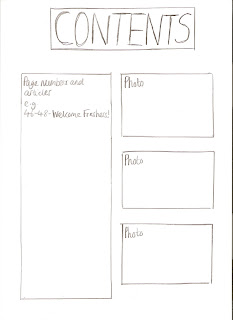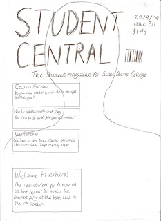

These are the flat plans for my front cover. Firstly, I chose to use a bold, capital font for the masthead, called Malgecito. I have done this as I wanted the title to stand out in the magazine. I decided to use another simple font for the rest of the text called Soolidium, as it was simple, but at the same time a trendier font as it is for a student magazine. Also, it could be easily seen on the page. The fact that I have chosen to use only two fonts, and the types of fonts I have used will appeal to my target audience as they are bright and bold and also fit with the trendy layout of the magazine cover. For my masthead, I also decided to use a bright blue font, which stands out against the rest of the text and the photo on the magazine. I think this would appeal to my target audience, which is students of the college, as they will like to have a title that will be bold and easy to read but at the same time looks good. I have tried to use very exciting language and punctuation on the front cover, to entice the reader. However, at the same time the language is simple, as I want it to appeal to all types of students, not just intellectual people. For example, in the main flash I have tried to include this language- "The new students for Autumn '09 are here again!". I have used exclamation marks to grab the readers attention and make the article sound more interesting, but at the same time I have not used language that is complex. This kind of language would appeal to my target audience as they would be put off if the magazine used very formal language, and would find the simple, friendly language more approachable. I have also included this kind of language in my main sells e.g. "You can party and get your work done!". This makes the magazine sound approachable as this is how young people would speak-in an informal way. Another main sell that used a different type of language was this "Do you know whether you've chosen the right course for you?". The language in this main sell is meant to sound friendly and welcoming, as if students feel that they are not on the right course they will be feeling stressed. This type of language would appeal to the target audience as it makes the reader feel welcome. Also, as it is a rhetorical question, it makes the magazine feel more personal, as if the question is aimed at the reader. I have included important information like the date, issue and price in the top hand corner as it is the usual layout for this information to be. Also, it can be easily seen on the magazine, and I have tried to make it stand out as much as possible. This would appeal to the target audience as they would like the magazine to stick to the usual format, so they could find the price easily, and would like it to be easy to read and clear. The layout of my contents page is fairly simple. I have made the heading of the contents in bold capitals, and very large on the page, and this would appeal to my target audience as they would like to be able to know what the contents page was quickly and easily. I have out all the page numbers and articles on the left hand side of the page, as this is the usual format for a contents page, and teenagers would like this as they are familiar with it and would be able to find articles easily. Finally, I have included photos relating to the articles on the right hand side of the contents page, as this provides a bit more interest to it and also shows people a bit more about the articles. This would appeal to teenagers, as if they were interested in a particular article, but did not know what it was about, they may be able to see a relating photo to it and understand a bit more about it. Overall, I think that all my design choices have been reflected in my target audience, as my magazine would definitely appeal to my target audience.
No comments:
Post a Comment