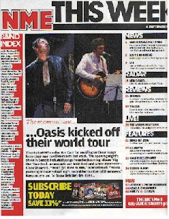
I have chosen to analyse an NME contents page, as it relates to my chosen genre of music magazine.
The structure of the contents page is very simple. Rather than having just a list of contents, it is split into different categories. For example, there are categories for "news","reviews" and "features". This makes the pages of the magazine a lot easier to find, and simplifies the process of finding a particular article. There is also a band index, which lists all the bands featuring in that particular issue. This is useful if someone is looking to see whether a particular band is in that issue. There are two medium sized images, but they do not dominate the whole of the page unlike the front cover. The images relate to a highlighted article, which is one that has not been shown on the front cover in any of the main sells. The fonts used are also different to the front cover, and they are reminiscent of fonts used in newspapers, however, the main NME emblem is the same as on the front cover, just to advertise the brand a bit more. The font colour scheme is generally the same, however, unlike the cover mainly black has been used for most of the text and red and yellow text are very minimal on the page. Red text boxes have been used which carry on with the theme of red throughout the magazine.
Overall, the contents page has a very newspaper style layout, which fits with the title New Musical Express, and would fit with audience expectations of the magazine.
No comments:
Post a Comment