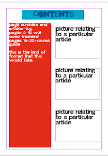
 This is my final contents page design. I asked members of my class about it to get feedback from my target audience. They felt that the good parts of it were that it was simple and easy to read. However, some people thought that the layout could have been improved by making it a bit more individual. Overall, however, the feedback was good. I will take it into account when creating my completed contents page for my coursework.
I think my contents page layout has also worked out well. Although it is simple, it works effectively. This is because if a simple contents page is used, people will be able to find information on it easily, and also will be used to the layout as this is the standard contents layout for most magazines. However, I think that some areas of it could have been improved. For example, I think that I could have used different fonts from the ones used on my front cover, as this would have provided a bit more variety. I also think that although the layout is simple, it could have been made a bit more out of the ordinary e.g. with boxes on different angles. This may have made it more interesting. Overall, however, I think that the style of the contents page fits with the nature of the magazine, which makes it very effective.
No comments:
Post a Comment