Friday, 23 October 2009

Analysis of a double page spread

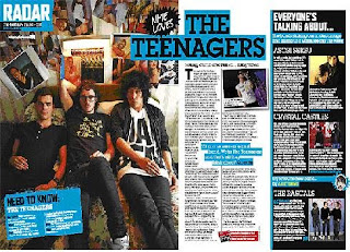
I have analysed an article from NME magazine on "The Teenagers". The language use and tone are very important in showing the target audience in this magazine. Firstly, the article uses very sexual language, which helps to connote the kind of audience that they are targeting at, and also fits with the theme of the other article on the spread-a band with "filthy tunes". This kind of language is very ordinary and colloquial, and gives the article a friendly, relaxed tone, as this is how people would talk in everyday life. This shows the reader that the article is not a particularly serious, in depth one. The article as a whole uses very relaxed, everyday language, to make the reader feel at home. Another part of the spread with sexual connotations is: "the bands stroking our undercarriage and giving us a warm feeling this week". This helps to show that the magazine has an older audience, and is not based at 13 year olds and younger teenagers. Also, there is a caption saying "need to know". This kind of language is used in the article to entice you into reading it, and showing it is important to understanding the article a bit more. Finally, where there is a quote from the band in the middle of the page. Casual language is used in this. This is used to help show the reader that the people in the band are just ordinary people, and the quote also helps to show that they relate to teenagers and people who aren't their own age-"Of course we're a sexual band. We're The Teenagers and that's all they think about".

Five images are used in this double page spread, and they definitely dominate the article, which has a limited amount of text. This is because images make the page more interesting, and help to show a bit more of what the article is about. There is one main image on the page and a smaller image, which shows the band in the main interview. This image creates a certain mise-en-scene, and again helps to suggest the target audience of the article. It shows the band lying casually on a sofa, and they are all in very relaxed positions. This helps to suggest that the band are just everyday people, and are not upper class or snobby. The clothes the band are wearing are all black, which helps to suggest the genre of their music. Also, they are all wearing fairly fashionable clothes, and this will interest readers as it is showing them fashions of the time. The members of the band are wearing fake glasses, which make them look stereotypically "nerdy". This helps to suggest to readers that they are just ordinary people that you can relate to. The background in the photo looks quite upper class, however the photos on the wall contradict with this. There are very sexual images of women plastered all over the wall, and this again helps to suggest the sexual nature of their music. This kind of setting helps to show the target audience, as they may be able to relate to these kind of settings, especially if they are someone like a student at university. There are also three mini images on the spread of other bands. These relate to a side article on the spread called "Everyone's talking about". This mini-article gives reviews of up and coming bands that are not yet well known. The images show the bands in dirty, raw settings like council estates, and this helps to suggest the nature of their music and also the fact that anyone can read NME.

The article has used a pull quote from the band, and it is highlighted in a blue label, which makes it stand out from the rest of the article. The photographs on the spread do not really have captions, as the images themselves are pretty self explanatory, and do not need a caption. However, there is a caption for one of the images. The first paragraph of the article is not in bold, and this is maybe to stop people just reading one paragraph, and encourage them to read the whole article. However, the article does start with a drop capital of the first letter, "T", which helps to make the first word stand out on the page, and entice you into reading the article. The article in this double page spread has used a different colour scheme of black and blue, which provides a bit more interest to the magazine. Text boxes are used for important bits of information of the article, for example quotes, a fact file, and the contents page heading it comes under-"radar". A large separate text box has been used for the side article on the spread, to separate it from the main one.

Overall, the double page spread is very good at targeting its target audience both in its language use, and its easy layout. The target audience would like a clear layout on the page so they can find information easily.
Analysis of a contents page


I have chosen to analyse an NME contents page, as it relates to my chosen genre of music magazine.
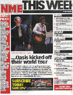
The structure of the contents page is very simple. Rather than having just a list of contents, it is split into different categories. For example, there are categories for "news","reviews" and "features". This makes the pages of the magazine a lot easier to find, and simplifies the process of finding a particular article. There is also a band index, which lists all the bands featuring in that particular issue. This is useful if someone is looking to see whether a particular band is in that issue. There are two medium sized images, but they do not dominate the whole of the page unlike the front cover. The images relate to a highlighted article, which is one that has not been shown on the front cover in any of the main sells. The fonts used are also different to the front cover, and they are reminiscent of fonts used in newspapers, however, the main NME emblem is the same as on the front cover, just to advertise the brand a bit more. The font colour scheme is generally the same, however, unlike the cover mainly black has been used for most of the text and red and yellow text are very minimal on the page. Red text boxes have been used which carry on with the theme of red throughout the magazine.
Overall, the contents page has a very newspaper style layout, which fits with the title New Musical Express, and would fit with audience expectations of the magazine.

Tuesday, 20 October 2009

Analysis of two music magazine front covers


I have chosen to analyse Kerrang and NME, as although they are not entirely similar genres, they both have similar features. In making my magazine however, it will be more similar in music styles to NME, rather than the heavy music that is shown in Kerrang.

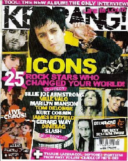
The NME target audience is people aged 15-44, but mainly people in their 20s who are either in university, office workers or professionals. They will mainly be in the A, B and C1 classifications. They will also mainly be males. They will have interests like going to festivals and playing games. They will mainly be individualists who would want to be different by listening to music, or succeeders, who are people who are succeeding and would have the disposable income to buy the magazine. The Kerrang target audience is much younger-it targets people of ages 14-24. It mainly appeals to teenagers. They will mainly be males, however the pink on the cover suggests that the magazine is not all male-orientated. They will mainly be in the E classification, as they will be students at college or university. Their interests will be things like going to gigs, and gothic fashion. They will mainly be individualists: people who are wanting to be different by listening to heavy music instead of chart music.

The titles of the magazines are very different. NME has been given this name as I think that it gives it a more grown up edge compared to the name Kerrang. Also, the name makes it sound this way because it has a name similar to a newspaper, as it is still seen as a music paper-New Musical Express. This kind of name would appeal to the target audience as it sets the magazine apart from other magazines, and makes it seem more serious than other music magazines. The name Kerrang, however, is aimed at a different audience. They have chosen this name as it does now really mean anything, and is not a real word, so it gives the magazine a more fun edge than the name NME does.

The NME front cover is limited in its use of colour for text, however, the picture shows a range of different colours. The red colour of the title of the magazine, NME, really makes it stand out against the photo beneath it. Also, the fact that it has been outlined in both white and black, helps to make it a focal point on the cover. Another text colour that really stands out on the page is the yellow font, which helps to highlight the main flash as an important piece of text on the cover, and also helps to suggest happiness, as yellow is a bright sunny colour. Also, the fact that the yellow colour is used at the top to advertise headliners at Glastonbury that year helps to highlight it against the background. Blue boxes are also used for the headings of the main sells, and special articles e.g. "Blur R.I.P". This helps to make them be seen clearly, so you know that those bands are important in the magazine. It also helps to highlight particular parts of the main sells, as the rest of the text in the main sells is white. The text colours fit with the colours in the main image, as they are all colours that go together, and also because the colours in the picture are relatively dark, this allows the font colours to stand out more. These type of text colours appeal to the magazine's target audience, as they will want text that is bright and fun, but still easy to read. The Kerrang cover also uses colour in a very strong way. It uses pink to highlight certain parts of the text, such as the main flash and the tagline-"life is loud". The pink helps to suggest that the magazine is maybe more orientated towards a uni-sex audience, rather than a mostly male audience. Other font colours that are used are yellow and white, which stand out against the background, which is relatively dark. The yellow in the article is used to highlight names of bands and key words, which makes them clearer to read on the cover. Black text is used for the cover, and this helps to suggest the nature of the music (loud heavy metal) and also makes the title stand out against the plain white background. The text colours fit with the background colour, as black is mainly used in the background, which helps to make them stand out. Also, some yellow is used in the background, which matches one of the text colours. The use of many different colours of the Kerrang front cover would appeal to its target audience, as it makes it more interesting and appealing.

The NME front cover uses about four fonts. Limiting the amount of fonts would appeal to the target audience as they would feel that it is not too overbearing and much easier to read. They use bold capital letters for things like the name of the magazine and the bands featuring in it. The main flash however, is all in lower case but it has been made bolder and is much bigger than any of the other information on the page. The fact that some of the writing in this is slightly tipped over and not straight on the page makes the article look more interesting. The other main sells use lower case for the information about them, and have not been made bold. This is maybe because the names of the bands mentioned in the head of the main sells are enough to tempt someone to read it, without having to look what it is about. Un-bold capitals are used for the caption underneath the title of the magazine, and that is because it is of little importance to the reader as most readers will know what the magazine stands for anyway. The use of different fonts and font styles would appeal to the target audience of this magazine, as they could find the important and interesting information on the cover quickly, and not have to focus on un-important information as well. The Kerrang cover uses a very limited amount of fonts: about three. Most of the information on the cover is all in one font, which is a bold font in capitals. However, some parts of text are made bolder than others, to highlight particular words and phrases, for example "icons" is made the boldest on the page. A smaller font is used for the names of more of the bands that will be appearing in the issue, but this writing is still very bold on the page. A different font is used for the caption of the magazine, and this is a very haphazard font. This helps to suggest the type of chaotic music that is in the magazine. Overall, the text on the Kerrang cover would appeal to its target audience as they would be able to find band names and important pieces of information on the cover quickly.

Both magazines have used language in a very simple way. In the NME cover, they have used quite informal, simple language, which is easy for the reader to understand. e.g. "silly". However, they also use quite specialist language which some people would not understand e.g. "ukulele". This is a music instrument that a lot of people may not have heard of. This kind of language would appeal to the target audience as they would like the language to be informal as it makes the magazine more welcoming. Also, the musical language would appeal to them as it helps to enforce that NME is a specialist music magazine, and is not all about ordinary chart music. Similarly the Kerrang cover has used very simple language, which is informal. It has also used a lot of informal punctuation like exclamation marks, to emphasise points e.g. "live chaos!". The Kerrang magazine also uses numbers to simplify the writing. The target audience of Kerrang would like the magazine to use this simple, informal language as again it makes the magazine seem more friendly, and is also easy to read and find out information quickly.

Images are very important on the covers of magazines. On the NME cover, images are used to show photos of bands, for example the band in the main flash, The Wombats. The Wombats are mainly a UK band, so therefore the magazine is not appealing to people internationally. They have chosen to have The Wombats on the front cover as they are not big international stars, which helps to suggest that the magazine is all about the indie music scene, rather than the mainstream. Also, the fact that the images on the cover are all of males helps to suggest that the magazine is targeted at a male audience. The clothes that the bands and artists are wearing are important, as they help to show a style for the readers of the magazine, and suggest what kinds of fashions are around for more individual people. The bright, old fashioned shirts and girls jewellery help to make the cover look a lot brighter. The people in the image look like they are having fun and just posing: one of the band is jumping in the air, the other is pulling his hair so it sticks up, and the other is doing a mock shocked face. None of the people in the image are smiling, which helps to suggest that the band being featured are cool, and also that the magazine is a high class music magazine. The images on the cover would appeal to the target audience as they help to show them a bit more about the bands and indie style. The Kerrange cover uses many images. None of these images are bright: they are either in very muted colours or black and white. This helps to show the dark aspect of the metal genre. They show the different artists featured on the cover. The main image is of Billie-Joe Armstrong, and he has been posed in a very moody fashion. This helps to suggest the type of music that will be featured in the magazine-moody rock music. The fact that he is from Greenday, a huge international band, helps to suggest that the magazine has an international audience. They have chosen to have him as the main image as he would help to attract more readers. By the make-up and the clothes that they are wearing, the reader can learn a bit more about the band/artist's personality, and also learn more about fashions for people who like a more heavy metal genre. Overall, this would appeal to readers of Kerrang, as they are used to seeing metal artists dressed like this, and would find them useful in seeing change in a band or current fashions for the particular genre.

The NME magazine has a fairly standard layout. It has the photo of the band in the main flash taking up the whole of the cover, with a banner about other artists featured both at the top and bottom of the cover. The main flash is placed in the centre of the cover, and this makes it easy to see. The main flash is about a particular band, The Wombats, and contains an interview with them. The main sells are on both the right and left hand side of the cover. The main sells of the article are about individual bands: Muse, The Cribs, Blur and Panic At The Disco. These kind of main sells and the main flash would appeal to the target audience as they will be reading the magazine because of the interviews, to get a more personal look at different bands. The title is in the top right hand corner, however, as the font is so bold on it it still stands out on the page. Other information presented is things like the barcode, price, date and issue, and these are placed in the bottom right hand corner, as they expect regular readers of the magazine to know things like the price without them having to look too hard. Overall, this layout would appeal to the target audience as it is easy and simple to read, which would help when trying to find out information about a certain article. The Kerrang cover has a slightly different layout. There is a banner both at the top and bottom of the cover displaying important information about bands etc. The main photo on the cover is placed over the title, which is at the top of the cover, as the magazine is so well know you do not need to see all of it. The main photo takes up most of the page, however there are many photos on the right and left hand side of the cover that overlap it. The main flash is placed at the centre of the cover, which draws attention to it straight away. It is a list of rock icons. The main sells are placed to the side of this, with the photos of other artists. These are about individual artists or bands, and are generally interviews with them. Overall, this kind of layout would appeal to the target audience of Kerrang, as it is very chaotic, and suggests the chaotic music inside the magazine.

Target audience for music magazine


I have based these ideas on the NME readership details per issue. A total of 388,000 adults read NME per issue. 250,000 people of the socio-economic groups A, B and C1 read the magazine per issue. People of A, B and C1 groups are people like high ranking professionals, middle ranking professionals and "white collar" (office) workers. There were 137,000 readers from the C2, D and E socio-economic groups. These groups are people like skilled manual workers, semi and unskilled manual workers and people getting state benefits. 339,000 of the readers were from the age group of 15-44. Only 49,000 of the 45+ age range were readers. In total 296,000 of the readers were men. 91,000 of the readers were female. These results show that the general the average reader is a male in the A, B or C1 socio economic group, and is generally between 15-44 years of age. The link for where I found this information is: http://www.nrs.co.uk/toplinereadership.html, in general magazines.

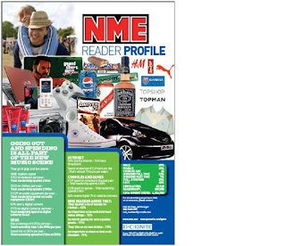
I have also based my target audience on the readership profile of NME. It showed mostly male items like phones, cars and trainers. It also showed pictures of things like festivals, topman clothes and hairgel. However, the fact that topshop is shown on the readership profile suggests that girls are also targeted to read the magazine. The information shown says that 69% of the readers are male, and 31% female. It also says the average age of readers is 24. There are also statistics about how much they spend on clothes, dvds, games and how much time they spend on the internet. Their results showed that 94% of readers used the internet. Therefore, the general reader is a male, who is of the average age of about 24. They are interested in games and fashion, and also enjoy going to music festivals and gigs. I will use these results to form my own target audience.


Using NRS I have also looked at what the target audience for Kerrang. A total of 417,000 adults read Kerrang. 239,000 of these were in the A, B and C1 categories. These are people like high flying professionals and office workers. 178,000 of these were in the C2, D and E categories. These are people like skilled and unskilled manual workers, students and the unemployed. 339,000 were in the age range 15-44, but only 49,000 were aged 45+. This shows that Kerrang magazine has a much younger audience, and doesn't really have any appeal to the older generation. A total of 290,000 of the readers were men, and 127,000 were women. Using this data I can see that Kerrang magazine is mainly targeted at young people between the ages of 15-30. I can also see that although the main gender target is men, it also appeals to women as it has a lot more female readers, compared to NME. The majority of readers were in the A, B and C1 socio economic groups, as they would have the disposal income to buy the magazine.

I have decided to use the same target audience as NME. Using the demographics that we have learnt in class, and looking at readership details and the readership profile for NME I have decided on my target audience. My target audience are going to be in the A, B and C1 socio-economic classification as most of them will be professionals, around the age of 24. They will be aged 15-44 in general; however, there will be a small percentage of older readers. Similarly, although most of the readers will be male, a small majority will be female. In psychographic terms, they will generally be individualists, who are people who are wanting to be different. They may also be succeeders, who have enough money to buy the magazine regularly, but do not need to show off their wealth to other people. They will read this magazine as they will want to be different by listening to different music, and going against the normal pop music that is on offer. They will shop at clothes shops like topshop and topman, and will often go to festivals and gigs like Reading, which is not aimed at teens. Also, they will play computer games, and use the internet regularly, but will not have a huge interest in movies. Overall, I think that the readership profile I have created really fits with the style of magazine I have designed, and the magazine would be something that my target audience would be interested in buying.

I also did some interviews with a range of members of my target audience, asking them what kind of music they liked and if an indie magazine would make a good idea. The feedback was generally positive, with most people saying that there was a need for a new indie music magazine. I found it really helpful having this kind of feedback, as I can then tailor my magazine for my target audience.

Introduction for final coursework

Our task for the coursework is to design and create a front cover, contents page and double page spread for a music magazine. The magazine has to be aimed at a particular genre, for example, it may be aimed at pop readers or more indie readers. My magazine will be aimed at more indie readers, as this is the kind of music I am into, with artists like Florence and the Machine and Friendly Fires. This main task is a development of my skills learnt from the preliminary task, so therefore I am more familiar with the InDesign software.

Monday, 19 October 2009

Final Contents Page Layout

This is my final contents page design. I asked members of my class about it to get feedback from my target audience. They felt that the good parts of it were that it was simple and easy to read. However, some people thought that the layout could have been improved by making it a bit more individual. Overall, however, the feedback was good. I will take it into account when creating my completed contents page for my coursework.

I think my contents page layout has also worked out well. Although it is simple, it works effectively. This is because if a simple contents page is used, people will be able to find information on it easily, and also will be used to the layout as this is the standard contents layout for most magazines. However, I think that some areas of it could have been improved. For example, I think that I could have used different fonts from the ones used on my front cover, as this would have provided a bit more variety. I also think that although the layout is simple, it could have been made a bit more out of the ordinary e.g. with boxes on different angles. This may have made it more interesting. Overall, however, I think that the style of the contents page fits with the nature of the magazine, which makes it very effective.

Thursday, 15 October 2009

Flat Plans


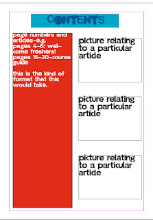
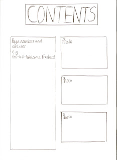
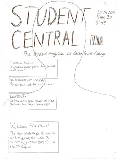
These are the flat plans for my front cover. Firstly, I chose to use a bold, capital font for the masthead, called Malgecito. I have done this as I wanted the title to stand out in the magazine. I decided to use another simple font for the rest of the text called Soolidium, as it was simple, but at the same time a trendier font as it is for a student magazine. Also, it could be easily seen on the page. The fact that I have chosen to use only two fonts, and the types of fonts I have used will appeal to my target audience as they are bright and bold and also fit with the trendy layout of the magazine cover. For my masthead, I also decided to use a bright blue font, which stands out against the rest of the text and the photo on the magazine. I think this would appeal to my target audience, which is students of the college, as they will like to have a title that will be bold and easy to read but at the same time looks good. I have tried to use very exciting language and punctuation on the front cover, to entice the reader. However, at the same time the language is simple, as I want it to appeal to all types of students, not just intellectual people. For example, in the main flash I have tried to include this language- "The new students for Autumn '09 are here again!". I have used exclamation marks to grab the readers attention and make the article sound more interesting, but at the same time I have not used language that is complex. This kind of language would appeal to my target audience as they would be put off if the magazine used very formal language, and would find the simple, friendly language more approachable. I have also included this kind of language in my main sells e.g. "You can party and get your work done!". This makes the magazine sound approachable as this is how young people would speak-in an informal way. Another main sell that used a different type of language was this "Do you know whether you've chosen the right course for you?". The language in this main sell is meant to sound friendly and welcoming, as if students feel that they are not on the right course they will be feeling stressed. This type of language would appeal to the target audience as it makes the reader feel welcome. Also, as it is a rhetorical question, it makes the magazine feel more personal, as if the question is aimed at the reader. I have included important information like the date, issue and price in the top hand corner as it is the usual layout for this information to be. Also, it can be easily seen on the magazine, and I have tried to make it stand out as much as possible. This would appeal to the target audience as they would like the magazine to stick to the usual format, so they could find the price easily, and would like it to be easy to read and clear. The layout of my contents page is fairly simple. I have made the heading of the contents in bold capitals, and very large on the page, and this would appeal to my target audience as they would like to be able to know what the contents page was quickly and easily. I have out all the page numbers and articles on the left hand side of the page, as this is the usual format for a contents page, and teenagers would like this as they are familiar with it and would be able to find articles easily. Finally, I have included photos relating to the articles on the right hand side of the contents page, as this provides a bit more interest to it and also shows people a bit more about the articles. This would appeal to teenagers, as if they were interested in a particular article, but did not know what it was about, they may be able to see a relating photo to it and understand a bit more about it. Overall, I think that all my design choices have been reflected in my target audience, as my magazine would definitely appeal to my target audience.

Monday, 12 October 2009

Final Front Page

This is my final cover. Overall, I am quite pleased with it and think it has turned out quite well, as it looks quite professional.

I am pleased with the blue font for the title of the magazine, "student central", as it stands out against the grey background of the photo. This was important as the title of the magazine is the main part of the title page. Also, I like the bold, but also fun font for the title, as I think that it appeals to my target audience. I think that overall, the title is effective on the page.

I have also limited the amount of fonts I have used to two, as this is a technique that most magazines use, as it makes the writing easier and simpler to read. I have used the same font for all the main sells and the main flash, along with information about the magazine such as price, and the tagline. I think that using the same font throughout has allowed my magazine to be easily read, and look professional, but at the same time be interesting and eye catching.

I am also pleased with the layout of the magazine, and how it all fits together and looks professional. The main flash has been made bolder than the other articles, and is in a prime place on the cover so it can be seen easily. This makes it effective. Also, I think that the text has fitted nicely around the picture, and I think this has worked successfully, as if I had had to put text over a main part of the photo e.g. Mischa's face, this would have instantly made the cover look un-professional.

I asked members of my class, who are my target audience, what they thought of my final cover. They thought that it was very effective, and particularly liked the effect of the fonts used, and thought that they made the article look very professional. However, they said that areas I could have improved on were the quality of the photo. I would agree with this feedback, and will try to incorporate it into my next project so I can improve.

Overall, I think that most of the elements of my magazine have worked out effectively, as I believe it looks professional, considering the amount of time we had to do it in. However, there are things about the magazine that could have been improved. For example, I think that the date, issue and price of the article could have been made a bit clearer, as they are not as bold as all the other pieces of text on the cover, which really stand out. I also think that although the picture is presenting the kind of attitude I wanted the magazine to connote, it could have been of a better quality, as in real magazines the photos are made to look extremely airbrushed and professional. However, I think that without the use of a professional camera, this was not possible. I think that despite the faults in my magazine cover, it has still proved to be a very good quality and effective piece of work.

Tuesday, 6 October 2009

Photographs


These are two examples of the photos I took for my front cover. I have chosen the first photo, which shows Mischa with his hands on his hips. I have chosen this photo as it shows his looking confident and relaxed, and this helps to suggest the relaxed atmosphere at college-the image has a relaxed mise-en-scene. The second photo would not have made a good front cover, as Mischa looks apprehensive and nervous, which would not be portraying the right image for college. Also, the photo has Mischa against a white background, which makes the image stand out. I have also chosen it as it was taken at a front on angle, and not an angle above or below Mischa. This would make him look either too small or too big. Overall, the photo would appeal to students of the college as it is showing a confident and happy student, which would help to reassure them that they will be able to have a good time at college.

Monday, 5 October 2009

Chloe Lamb AS Media Preliminary Task

For our preliminary task, we have been asked to design a fully completed front page and a rough outline for a contents page, for the SDC magazine. We will use a software called Adobe InDesign to design the covers, and will also have to include photos in the front cover. This can either be aimed at the students of the college, or the teachers. The target audience for my magazine will be the students of the college, which is people of ages 16-19. This is because I have included articles that would interest them e.g. an article about freshers night.